BackColor Property
Gets or sets the background color of the object.
object.BackColor = [color]
Where object is an object expression that evaluates to one of the controls in the Applies To list, and value is a value or constant as described in Settings below.
Client support
 Newlook Smartclient
 Newlook Server
Version Support
 from version 11.0 for the ImageList control. Refer to Deprecated and Obsolete features for additional information.
 App Object
This property determines the background color of the runtime area in graphical mode (as opposed to emulator mode).
Use
Setting the BackColor for the App object will prevent the default windows background color from being displayed when one form is closed but before another is opened, creating a smoother transition between forms that have custom background colors.
App.BackColor can be set via a SetValue macro action or script method at start up, or by setting the background color mapped to Host Black in Color Settings.
Form Object
This property determines the background color of the specified form.
Use
This property is useful if you have specified a global background color in Settings > Color Settings or by setting App.Backcolor at startup, but you wish to override it for individual screens.
Command button
This property determines the color of the command button's background.
Skin limitations
None. Supported in both Material and Classic skin.
It is possible to specify a custom back color for the command button with either skin enabled, it is important to note though that the default background color of the command button varies between the skins - see below.
Use
Classic Skin
Under the classic skin, if a command button's BorderStyle property is set to Raised, then its default back color will be the 3D system button face color. If a command button's BorderStyle property is set to Simple or None, then its back color will default to App.BackColor.
Setting the BackColor property to something other than the default color will render the control as a flat button, even if the BorderStyle property is set to Raised. If you want to retain a 3D style button with a custom background color, you can use the Picture property with a custom graphic, to achieve the desired look.
Material Skin
Under the material skin, a command button's back color will default to the primary material color specified in display settings, irregardless of the value of BorderStyle.
Setting the BackColor property to something other than the default color will render the control as a flat button in the specified color.
Datagrid cell object
This property determines the color of a datagrid cell's background.
Use
This property is useful if you wish to set the background color of a specific cell in a grid to a custom color. This may be useful if you want to highlight a value in a grid.
It is only possible to set a cell's BackColor property via a script or macro.
The following JScript line of code will set the background color of the cell on the 2nd row and 3rd column to red:
App.ActiveForm.myGrid.Cells(1,2).BackColor = nlClrRed;
Tab page object
This property determines the color of the tab page's background.
Skin limitations
None. Supported in both Material and Classic skin.
It is possible to specify a custom back color for a tab page with either skin enabled, it is important to note though that the default background color of a tab page varies between the skins - see below.
Use
Classic Skin
Under the classic skin, if a tab page's BackColor property is set then the page will render with this backcolor. If it is not set, its back color will default to system gray.
Material Skin
Under the material skin, if a tab page's BackColor property is set, then the page will render with this backcolor. If it is not set, its back color will default to App.BackColor.
Other controls
This property determines the color of the control's background.
Skin limitations
None. Supported in both Material and Classic skin.
Use
This property is useful if you wish to provide a custom backcolor for your controls.
If a control's BackColor property has not been explicitly set, it will default to App.BackColor, and any entry capable areas in the control will default to white.
Settings
The settings for color can be specified in one of the following ways:
|
Setting |
Description |
JScript Example |
|
Hexadecimal colors |
A hexadecimal value for Color can be specified by using the either the Themed or Custom color palette (see notes below) or by specifying the hexadecimal value of the color in the following format:
|
App.Activeform.MyLabel.BackColor = "&H000066FF"; |
|
Named colors |
Colors specified in the Named tab of the Color palette (see notes below). |
App.Activeform.MyLabel.BackColor = "Tomato"; |
|
Constant |
One of the Newlook color constants. Refer to Color Constants for a full list. |
App.Activeform.MyLabel.BackColor = nlClrBlue; |
Color Palettes
There are
|
|
|
|
|
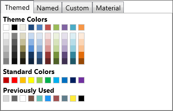
Themed Color Palette Allows the user to select a color from a series of themed color palettes. |
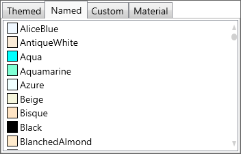
Named Color Palette Allows the user to select a color from the basic and extended .NET color keywords. |
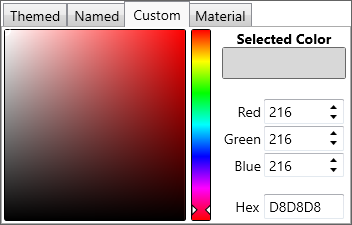
Custom Color Palette Allows the user to enter specific RGB values, Hex value or select a color from a broader color palette. |
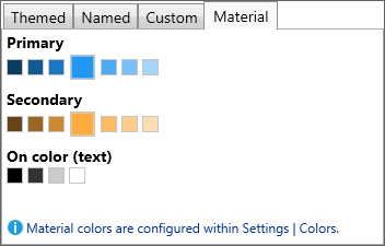
Material Color Palette Allows the user to select a color which is a shade of the current material skin's primary and secondary colors. |
Converting color values in scripts and macros
It is possible to specify color values in either the hexadecimal-based &H00BBGGRR format or as a decimal value when setting color-based properties dynamically in a script or macro.
It is important to note though, that macros return colors in the hexadecimal format whereas scripts return colors as a decimal value.
Occasionally you may need to convert from the decimal format to the hexadecimal-based format in order to compare values within a script. To do this you can use the following code in your script:
VB SCRIPTvHexColor = "&H00" & Hex(App.ActiveForm.BackColor) JAVASCRIPTvHexColor = "&H00" + App.ActiveForm.BackColor.toString(16); |
See Also
BackStyle property | Color constants | MaskColor property | BackColor Inheritance | Transparent property | UseSecondaryColor property
Applies To
© 2004-2021 looksoftware. All rights reserved.