Treeview Control

A TreeView control displays items in a hierarchical display. Each item, called a node, may contain parent or child items, and may be expanded or collapsed via a mouse click.
Client support
 Newlook Smartclient only.
Use
This control is useful for displaying data which is hierarchical in nature. It allows users to expand only the information that they need to see. Tree view nodes can also be displayed with check boxes which makes it possible to programmatically select or clear nodes by setting the Node's Checked property to true or false.
After inserting a tree view control in Designer, you can add, remove or reorganize Node objects by setting the relevant properties in Designer or invoking the relevant methods via a script.
The key property of the TreeView control is the Nodes property. It contains an array of nodes for the control. Icons can be displayed next to nodes by associating an image list control with the tree view's Icons property. Specific icons can then be assigned to individual nodes via the Icon and SelectedIcon property.
At runtime it is possible to return the node that the user has clicked via the LastClickedNode property.
Material skin considerations
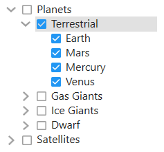
When the material skin is enabled in your solution, tree view controls will be rendered with material styling. The most noticeable difference is a cleaner appearance, no borders and more spacing within the tree. If you have checkboxes enabled, then they will be rendered with the material primary color in the selected state.
|
Material skin |
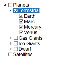
Classic skin |
|
|
|
 Common TreeView Tasks
Inserting a TreeView control
- Open the relevant screen
in Designer (
 )
mode.
)
mode. - Select Insert|TreeView ()
from the main menu, then use your cursor to draw the graphic area on the
screen.
- Set any relevant properties for the tree view in the Properties pane.
Inserting Nodes manually in Designer
- Select the tree view control in Designer.
- In the Properties pane, click the prompt button next to the Nodes property to open the TreeView Editor window.
- Click the Add button
 .
. - In the property editor, update the text property to specify the display text for the node.
- Add as many Nodes as necessary. Use the Add button if you wish to create a node at the same level as the selected node. Use the Add Child button if you wish to create a node below the currently selected node.
- For each node that is created, Newlook creates an associated Node object which is added to the Nodes collection.
- If required, select each node object and change any relevant properties i.e. icon, Backcolor, ForeColor etc. For more information on available node properties refer to the properties section of the Node object reference topic.
- To rearrange the order of nodes within a level use the repositioning buttons.
- Click OK to close the TreeView Editor.
Inserting Nodes dynamically at runtime
Nodes can be added to a tree view control's Nodes collection via the Add method. To remove all nodes from a TreeView use the Clear method, to remove individual nodes use the Remove method.
Returning the clicked node at runtime
The LastClickedNode property can be used within a script or macro to return the node that was last clicked, or any property of that node. ()
Properties
Newlook Smartclient |  Newlook Server |
  Deprecated
|
Deprecated
|  Obsolete
Methods
Newlook Smartclient | Newlook Server | Deprecated
| Obsolete
|
Property |
Client |
Description |
|
|
Ensures that the specified node is visible within the control, scrolling the tree view control if necessary. |
|
|
|
Returns the first visible item in the control. |
See Also
Node object | Nodes collection | ListView control
© 2004-2021 looksoftware. All rights reserved.