Style Property
Gets or sets a value which determines the visual style of the control. Read-only at run-time.
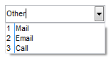
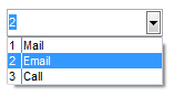
 ComboBox control
Gets or sets a value which indicates whether the combo box is editable. Read-only at run-time.
object.Style = [value]
Where object is an object expression that evaluates to one of the controls in the Applies To list, and value is a value or constant as described in Use.
Client support
 Newlook Smartclient
 Newlook Server
Use
This property can be used to specify whether a combo box will be displayed with an editable text box area and selection list or just a non-editable selection list.
The Style property options for the combo box control are:
|
Constant (Macros) |
Constant (Scripts) |
Integer Value |
Example |
Description |
|
ComboDropDown |
nlComboDropDown |
0 |
|
Includes a drop-down list and a text box. The user can select from the list or type in the text box (Default). |
|
ComboDropDownList |
nlComboDropDownList |
1 |
|
The user can only select from the given options in the drop-down list - it is not possible to type an option into the text box portion of the control. |
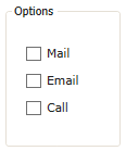
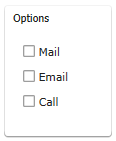
 Frame control
Gets or sets a value which determines the visual style of the Frame. Read-only at run-time.
object.Style = [value]
Where object is an object expression that evaluates to one of the controls in the Applies To list, and value is a value or constant as described in Use.
Client support
Newlook Smartclient only.
Use
The Frame control is a visual element only, it is not a container control (refer to the Panel control if you are looking for a control that will act as a container object). When Style is set to FrameGroupBox, the frame is typically to be transparent and designed to be placed over the top of existing controls when you would like to visually group or highlight them.
The Style property options for the Frame control are:
|
Constant (Macros) |
Constant (Scripts) |
Value |
Classic skin enabled |
Material skin enabled |
Description |
|
FrameGroupBox |
nlFrameGroupBox |
0 |
|
|
Classic skin: The frame control is rendered with a rounded border and the caption embedded in the top left corner of the border. In FrameGroupBox mode, the control is designed to be transparent however, if set, a picture or background color will display with a border around it. Material skin: The frame control is rendered with a rounded border and a drop shadow. The caption is displayed inside the border. In FrameGroupBox mode, the control is designed to be transparent however, if set, any image or backcolor will be applied to the border edge. |
|
FramePanel |
nlFramePanel |
1 |
|
|
Classic skin: The frame control is rendered with an unbroken square border. The caption is displayed inside the border and any image or backcolor specified will be applied to the border edge. Material skin: The frame control is rendered with an unbroken square border. The caption is displayed inside the border and any image or backcolor specified will be applied to the border edge. |
TreeView control
Gets or sets the visual style for the tree view. Deprecated property. Read-only at run-time.
object.Style = [value]
Where object is an object expression that evaluates to one of the controls in the Applies To list, and value is a value or constant as described in Use.
Client support
Newlook Smartclient only.
Version Support
 from version 11.0 for the TreeView object. Refer to Deprecated and Obsolete items for additional information.
Use
This property can be used to specify how TreeView nodes will be displayed within the control.
WARNING:
This property has been
The Style property options for the TreeView control are:
|
Constant |
Value |
Description |
|
TreeViewTextOnly |
0 |
Only the text is displayed (Default). |
|
TreeViewPictureText |
1 |
The text and images are displayed |
|
TreeViewPlusMinusText |
2 |
The text and a plus or minus symbol are displayed. |
|
TreeViewPlusPictureText |
3 |
The text, image, and a plus or minus symbol are displayed. |
|
TreeViewLines |
4 |
The text and lines are displayed |
|
TreeViewLinesPictureText |
5 |
The text, image, and lines are displayed |
|
TreeViewLinesPlusMinusText |
6 |
The text, plus or minus symbols, and lines are displayed |
|
TreeViewLinesPlusPictureText |
7 |
The text, image, plus or minus symbols, and lines are displayed. |
See Also
Alignment property | BorderStyle property | DisplayFormat property | Format property | LineStyle property | ShowDropDownListValues property | TextStyle property
Applies To
TreeView control
© 2004-2021 looksoftware. All rights reserved.