Frame Control

A frame control is used to visually group other controls on the form.
Client support
 Newlook Smartclient
 Newlook Server
Use
A frame control can be used to subdivide a form visually or functionally. For example, if you want to separate a group of option buttons from another group of option buttons, or you wish to indicate that a group of controls are a logical group then you could use a frame control to indicate this.
To ensure that controls inside a frame are visible, draw the frame first,
and then draw controls inside the frame. This ensures that the correct z-order is applied.
If you want to insert a control that will act as a parent container for other controls then do not use a Frame control as it does not become a container object. The panel control is a better alternative.
Material skin considerations
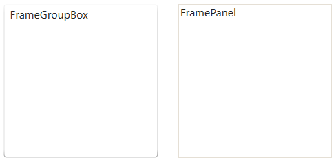
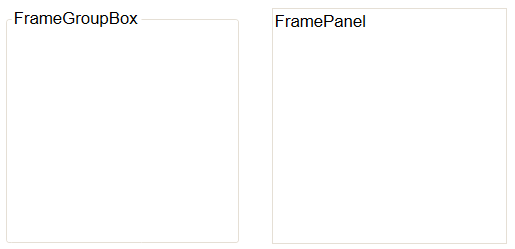
When the material skin is enabled in your solution, combo boxes will be rendered with material styling. Note that when the Style Property is set to FrameGroupBox, then the BorderColor
Property and BorderStyle
Property are ignored and the caption will always appear inside the control's border.
|
|
|
 Common Frame Tasks
- Open the relevant screen
in Design (
 )
mode.
)
mode.
- Select Insert | Frame ()
from the main menu, then use your cursor to draw the graphic area on the
screen.
- Draw or drag the controls that you want to group together onto the frame control.
- With the frame selected, select the Caption field in the Properties pane and enter any text that you want to appear as a title on the frame. If you do not want a title on your frame delete the default "Caption" text.
- Set any other relevant properties in the Properties pane.
- Insert a frame control on your form.
- Insert the option buttons that you wish to group together on the frame and set their Caption property.
- Decide which option button should be the default selection when the form is opened and set it's Value property to 1.
- Set the GroupStart property of the first option button in the group to True. This property tells Newlook where the group begins so that user navigation is restricted to one option button per group.
- Assign a relevant script or macro to the OnChange property of each of the relevant option buttons.
Properties
Newlook Smartclient | Newlook Server |  Deprecated
|
Deprecated
|  Obsolete
|
BackColor
|
|
Gets or sets the background color of the object.
|
|
BackStyle
|
|
Gets or sets a style which determines if the control's background is transparent or opaque.
|
|
Blink
|
|
Gets or sets whether the caption of the control blinks.
|
|
BorderColor
|
|
Gets or sets the control's border color.
|
|
BorderStyle
|
|
Gets or sets the style of a control's border.
|
|
BorderWidth
|
|
Gets or sets the width (thickness) of the control's border. Obsolete
|
|
Caption
|
|
Gets or sets the caption text of the control.
|
|
CCSID
|
|
Gets or sets the Coded Character Set Identifier (CCSID), which defines the control's code page and character set.
|
|
CssClass
|
|
Gets or sets the CSS class, or classes, for the control in Newlook Server. Server-only.
|
|
Enabled
|
|
Gets or sets the enabled state of the object.
|
|
FontBold
|
|
Gets or sets whether text should be shown in a bold font.
|
|
FontItalic
|
|
Gets or sets whether text should be shown with an italic style.
|
|
FontName
|
|
Gets or sets the name of the font family used to display text.
|
|
FontSize
|
|
Gets or sets the font point size used to display text.
|
|
FontUnderline
|
|
Gets or sets whether text should be diplayed underlined.
|
|
ForeColor
|
|
Gets or sets the foreground (text) color of the control.
|
|
FormControlsCollectionIndex
|
|
Sets or returns the current control index for an object.
|
|
GroupStart
|
|
Gets or sets whether this control is the start of a group of controls. Obsolete
|
|
Height
|
|
Returns or sets the height of the object's size in pixels at default size, which is the object's size at design-time.
|
|
Left
|
|
Determines the distance, in pixels, between the left edge of the control
and the left edge of its form or parent container at default size, which is the object's size at design-time.
|
|
Name
|
|
Gets or sets the name of this object.
|
|
Picture
|
|
Gets or sets the file name of the image to display in the control or form.
|
|
PictureAlignment
|
|
Gets or sets the image alignment in the parent container (form or control).
|
|
PictureColor
|
|
Sets or returns the color mapping that
is used to display an image in a form or control. Deprecated property. Obsolete
|
|
PictureOpacity
|
|
Gets or sets a value which determines the opacity of a picture in a form or control.
|
|
PictureQuality
|
|
Sets or returns the image quality of
a picture that appears in a form or control. Deprecated property. Obsolete
|
|
PictureSize
|
|
Gets or sets the way a picture is sized in its container. Smartclient-only.
|
|
PictureTile
|
|
Sets or gets a value which determines the method in which a picture
is tiled in the container (can be either a form or control). Deprecated property. Obsolete
|
|
Style
|
|
Gets or sets a value which determines the visual style of the control.
|
|
TabIndex
|
|
Gets or sets a value which determines the control's tab order.
|
|
TabStop
|
|
Gets or sets whether the Tab key can be used to set focus to the control.
|
|
Tag
|
|
Gets or sets user defined information for the control.
|
|
TextStyle
|
|
Gets or sets the text style of the control.
|
|
ToolTipText
|
|
Gets or sets the control's tool-tip text.
|
|
Top
|
|
Determines the distance, in pixels, between the top edge of the control
and the top edge of its form or parent container at default size, which is the object's size at design-time.
|
|
Type
|
|
Returns a value which specifies the control's type. Read only.
|
|
UseMnemonic
|
|
Gets or sets whether the control's keystroke mnemonic is embedded within the text.
|
|
Visible
|
|
Gets or sets whether the control, object or form is visible or hidden.
|
|
Width
|
|
Gets or sets the width of the object in pixels at default size, which is the object's size at design-time.
|
See Also
Panel control | PictureBox control
©
2004-2021 looksoftware.
All rights reserved.