Material skin
Material is a system of guidelines, components and tools developed by Google to support best practices in user interface design.
The Skin field in color settings, allows you to configure Newlook to render controls using a theme based on Material Design guidelines, rather than the classic Windows Aero theme.
Material design uses primary and secondary colors to indicate interactivity and hierarchy. The primary color will be used as the default color for focus and selection in certain controls. It will be the color displayed most frequently across your application screens. The secondary color is used to provide accent to selected parts of your UI. You can change primary and secondary colors at anytime however they will typically reflect your company or application branding.
How to configure Newlook to render controls using a material theme
- Open Settings > Colors.
- Set Skin to Material.
- Select a color from the predefined Primary color palette, or click on the color swatch to the left of the palette to select a custom color from the standard Newlook color picker.
- Manually select a color from the Secondary color palette, or click one of the Monochromatic, Complementary, Analogous or Triadic links, to select a harmonious secondary color based on the current primary color. You can also select a custom secondary color by clicking on the color swatch to the left of the palette to open the Newlook color picker.
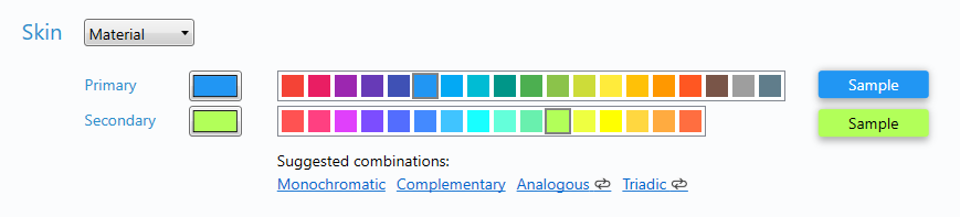
- Save your changes.
Setting an active scheme for the material skin (recommended)
Schemes are bound to skins, which means that when you switch to a different skin, Newlook will also switch schemes - automatically assigning the scheme last used with that skin as the active scheme. The first time you use the material skin, you will be asked if you want to create a material scheme. It is recommended that you choose this option as the scheme file that is created, MaterialLight.nlg, is designed to complement the material skin. If you have created a custom scheme file for your solution already, you can switch to this scheme at any time.
To associate a scheme file with a specific skin, the scheme only needs to be saved as the active scheme when that skin is enabled. Whenever you switch skins, Newlook will load the last active scheme saved for the skin.
If you selected 'Use existing scheme' when you switched to the material skin for the first time, but you would like to preview your solution with the recommended MaterialLight scheme, follow these instructions:
- Shutdown Newlook Developer and copy the MaterialLight.nlg file from C:\ProgramData\Newlook 11.1 into your solution folder.
- Reopen Developer, then open Settings > Colors.
- Make sure that Skin is set to Material.
- Select MaterialLight from the list of Schemes and click Make Active.
- Save your changes.
What effect does the material skin have on color-related properties?
When you enable the Material skin, most control properties will be respected. Some properties, like the BackColor of a command button for instance, will have a different default color, derived from the material primary color. Other control properties are handled by the skin, and anything set in Designer or at run-time will be ignored altogether.
The property grid in Designer will indicate if a property has skin limitations (i.e. it is only supported under the classic or material skin). If you are switching skins and you want to know if any of the properties you have already set on your forms will become redundant, you can use the compatibility report to return any items which are incompatible with the specified skin.
What effect does the material skin have on the appearance of controls?
Material Design uses color and movement to communicate hierarchy, state and focus. The following examples illustrate the differences in the default rendering of controls in Newlook:
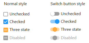
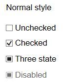
Check box control
When the material skin is enabled in your solution, you have the option to display checkboxes in the normal style or as switch buttons (set the UseSwitchButton Property to true). Checkboxes will render in the material primary color when selected and the secondary color when in the indeterminate state (for tri-state checkboxes).
|
Material skin |
Classic skin |
|
|
|
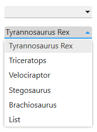
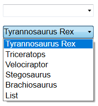
Combo box control
When the material skin is enabled in your solution, combo boxes will be rendered with material styling. The most noticeable difference is the increase in spacing between list items. this may mean that your lists are longer than they are with the classic skin.
|
Material skin |
Classic skin |
|
|
|
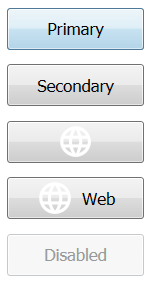
Command button control
When the material skin is enabled in your solution, by default command buttons will be rendered as flat buttons in your specified primary color. If the ForeColor Property or BackColor Property have been set then these colors will be respected. The UseSecondaryColor Property renders the button in your specified material secondary color, which is useful if you wish to highlight a particular button on the screen.
The following command button properties are ignored when the material skin is enabled: HoverColor Property, BorderColor Property, BorderStyle Property, BorderWidth Property and UseHoverColor Property.
|
Material skin |
Classic skin |
|
|
|
Data control
When the material skin is enabled in your solution, data controls will be rendered in your specified material primary color.
|
Material skin |
Classic skin |
|
|
|
Data grid control
When the material skin is enabled in your solution, data grids will be rendered with material styling. The most noticeable difference is a cleaner appearance and more spacing between elements in the grid (where possible). Entry capable cells will render with an underline when given focus.
|
Material skin |
Classic skin |
|
|
|
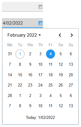
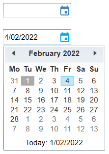
Date combo control
When the material skin is enabled in your solution, date combo boxes will be rendered with material styling. The most noticeable difference is a larger, cleaner calendar. There is no change to the behavior of this control or supported properties.
|
Material skin |
Classic skin |
|
|
|
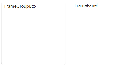
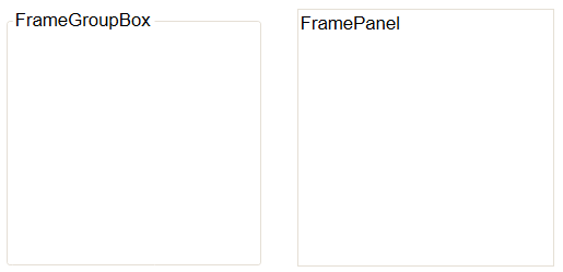
Frame control
When the material skin is enabled in your solution, combo boxes will be rendered with material styling. Note that when the Style Property is set to FrameGroupBox, then the BorderColor Property and BorderStyle Property are ignored and the caption will always appear inside the control's border.
|
Material skin |
Classic skin |
|
|
|
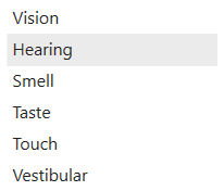
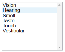
List box control
When the material skin is enabled in your solution, list boxes will be rendered with material styling. The most noticeable difference is an increase in the spacing within the list itself.
|
Material skin |
Classic skin |
|
|
|
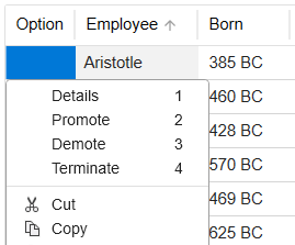
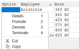
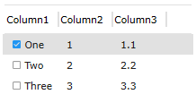
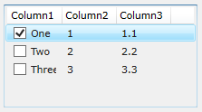
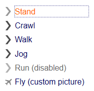
List view control
When the material skin is enabled in your solution, list views will be rendered with material styling. The most noticeable difference is an increase in the spacing within the list. If you have checkboxes enabled, then they will be rendered with the material primary color in the selected state.
|
Material skin |
Classic skin |
|
|
|
Menu button control
When the material skin is enabled in your solution, menu buttons will be rendered with material styling. The most noticeable difference is the change in styling when a menu item is selected.
The following menu button properties are ignored when the material skin is enabled: BorderColor Property, BorderStyle Property and BorderWidth Property.
|
Material skin |
Classic skin |
|
|
|
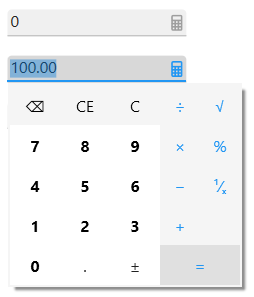
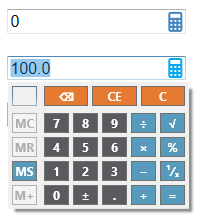
Numeric combo control
When the material skin is enabled in your solution, numeric combo boxes will be rendered with material styling. The most noticeable difference is a larger, cleaner calculator. With the exception of the CalendarBackColor Property, which is not supported under the material skin, there is no change to the behavior of this control or any other properties.
|
Material skin |
Classic skin |
|
|
|
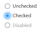
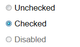
Option button control
When the material skin is enabled in your solution, option buttons will be rendered with material styling. The most noticeable difference is a change in styling when the button is selected. There is no change to the behavior of this control or any supported properties.
|
Material skin |
Classic skin |
|
|
|
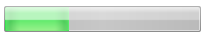
Progress bar control
When the material skin is enabled in your solution, progress bars will be rendered with material styling. The most noticeable difference is the control is rendered flat, in the material primary color. There is no change to the behavior of this control or any supported properties.
|
Material skin |
Classic skin |
|
|
|

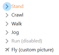
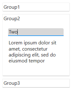
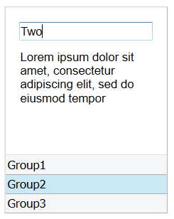
SmartNav control
When the material skin is enabled in your solution, smart nav controls will be rendered according to material principles, as an accordion control. The groups are vertically stacked and each group expands to reveal the content in that group. By default, the hover color for a group button will be a shade of the material primary color.
The following smart nav and smart nav group properties are ignored when the material skin is enabled: BorderColor Property, BackStyle Property (for the group) and ButtonSelectedColor Property (for the group).
|
Material skin |
Classic skin |
|
|
|
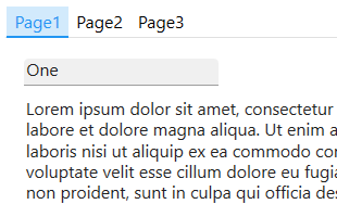
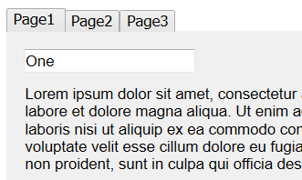
Tab control
When the material skin is enabled in your solution, tab controls will be rendered according to material design principles. The most noticeable difference is that the default tab control no longer has a border around it. When selected, tab button text will render in the material primary color, unless you specify otherwise.
The following command button properties are ignored when the material skin is enabled: HoverColor Property and SelectedForeColor Property. In addition, for the Alignment Property, only top and bottom are currently supported.
|
Material skin |
Classic skin |
|
|
|
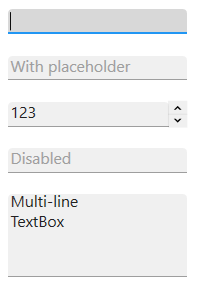
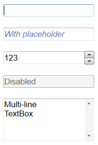
Text box control
When the material skin is enabled in your solution, text boxes will be rendered according to material principles. The most noticeable difference is that they render without top or side borders. When a text box has focus it is underlined in the material primary color. There is no change to the behavior of this control or any supported properties.
|
Material skin |
Classic skin |
|
|
|
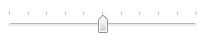
Track bar control
When the material skin is enabled in your solution, track bars will be rendered with material styling. The most noticeable difference is the control is rendered flat, in the material primary color. Apart from the TickStyle Property, which is partially supported, there is no change to the behavior of this control or any other supported properties.
|
Material skin |
Classic skin |
|
|
|

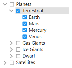
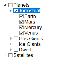
Tree view control
When the material skin is enabled in your solution, tree view controls will be rendered with material styling. The most noticeable difference is a cleaner appearance, no borders and more spacing within the tree. If you have checkboxes enabled, then they will be rendered with the material primary color in the selected state.
|
Material skin |
Classic skin |
|
|
|
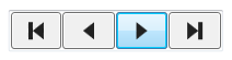
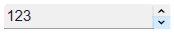
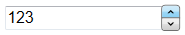
Up down control
When the material skin is enabled in your solution, up down controls will be rendered as a flat control in a shade of your primary material color. There is no change to the behavior of this control or any supported properties.
|
Material skin |
Classic skin |
|
|
|
See Also
For more information about Material Design, refer to Google's official Material Design documentation.
Color Settings | MaterialDesign property | UseSecondaryColor property
© 2004-2021 looksoftware. All rights reserved.