Color Settings

Use Color Settings to globally customize the default display of controls in your graphical forms. You can customize the skin used to render controls but also the colors, font type, style and size for each host screen element category across your application. It is also worth noting that Color Settings apply globally to your project, however it is possible to overwrite any color setting at the form or control level in Designer.
You can also save your color customizations as a scheme. This is helpful if you require multiple display options for your solution (for demonstrations, user acceptance or user groups requiring different display needs) or you wish to assign a specific scheme to the current skin. Creating a new scheme generates an .nlg file of the same name in your solution folder - this file contains all the color settings for that scheme. Specifying a scheme as the Active Scheme, will apply the color configurations from your saved scheme file to your current solution for the selected skin. You can associate a scheme file with a specific skin by setting it as active when you have that skin enabled, then saving your changes. Whenever you switch skins, Newlook will load the last active scheme saved for the skin.
 Skins
Skins
Use Skin to specify the design language used to render Newlook controls.
The material skin is designed to be combined with a material-based scheme file. A sample material scheme, MaterialLight.nlg, is installed in C:\ProgramData\Newlook 11.1. The first time you switch to the material skin, Developer will ask you if you want to create a material scheme. If you select 'Create material scheme', this file will be copied into your solution folder and set as the active scheme when the material skin is enabled. If you select 'Use existing scheme', the current scheme will be set as the active scheme for the material skin. You can always copy this scheme file into your solution folder at a later date and set it as the active skin, should you wish to change schemes.
|
Setting |
Description |
|
Classic |
Newlook controls are rendered with a Windows Aero theme. |
|
Material |
Newlook controls are rendered with a Material theme. Refer to Material skin for more information about this setting. |
How Color Settings work
When a screen is received by Newlook, the recognition engine divides the incoming screen into various elements and classifies each element as a specific category. A screen element's category is determined based on an algorithm which includes things like the element's position, other elements relative to it, the contents of the element and whether it is entry capable or not. This category dictates how the element will be displayed in a graphical form - whether it will display as a label control, a text box, a menu button or be ignored altogether (to name a few of the options).
Each host screen element is also sent through with various properties, these include a Background Color, Foreground Color and Reverse attribute.
Color Settings lets you globally configure how screen elements will be displayed in graphical forms. For each Newlook recognition category, you can specify a display font, font size, font style (bold, italic or underline), backcolor and default forecolor. If you want even more granular control, it is also possible to configure only those elements with a specific host color to display in the chosen color.
EXAMPLE
It's helpful to look at an example to illustrate how color settings work. The OS400 main menu has a read-only element, just above the menu items, that the Newlook recognition engine automatically identifies as the category Instruction (you can find out what category an element has been recognized as by opening the screen in Identify and hovering over an item).
This instruction field has been sent through from the host with a blue foreground and a reverse color attribute set to false. By default its background color will be black.

You can define how all Instructions will display in your application by selecting Instruction from the category drop down, and setting your desired font name, size and style. To configure the display color for instructions (regardless of what color they are being sent through from the host as), select the All colors option (which will select all host colors), and then select your desired Display As Foreground and Background color.
Alternatively, you can specify a different Foreground color for certain host colors (blue instructions for example) by selecting one or more colors from the host colors list and selecting a different color from the Display as Foreground color swatch.
In the example below, all blue host instructions will display in dark gray with an italic font in graphical forms at runtime.
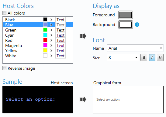
The sample at the bottom of the screen shows you what the original host screen element looked like and how it will display at runtime (where multiple colors have been selected, the host screen sample will reflect the first color selected).
Creating a scheme for your solution
It is recommended that you save your color setting customizations as a scheme (NLG) file. This allows you create multiple schemes or experiment with colors without affecting your existing configurations. When you create a scheme, an NLG file will be created with the same name in your current solution folder. This NLG file contains any changes you have made from the default Newlook color settings.
A solution can have multiple schemes files, the scheme applied to the solution will be the one marked as Active in Color Settings.
Follow these steps to create a new scheme:
- Click
 New
New - Replace the default Name with a name of your choice.
- With your new scheme selected, select each category and configure the color, font and size settings.
- Click the
 Make Active button to apply this scheme to your current solution.
IMPORTANT
If you are deploying your solution, it is important that you also deploy the active scheme file (.nlg) for your solution. If you are deploying to Newlook Server, it is possible to import scheme files in Server Settings. For Smartclient and Smartframe deployment, you will need to include the scheme file in your package contents (by default any scheme file in the current solution folder is included in the file selection for any new package). The default scheme for any new solution is Current Scheme. The associated CurrentScheme.nlg file will be created as soon as you make changes to the default Newlook color settings.
TIP
It is recommended that you set up a display scheme at the start of any modernization project. This will help reduce the amount of form or control level customizations required in your project.
Configuring color settings for a recognition category
Follow these steps to create a new scheme:
- Select the scheme that you wish to modify from the list of schemes.
- Select the Category that you wish to customize from the drop down list - refer to field categories for more information.
- Choose the font, font size and font style for the selected category.
- To set the default colors for this category select All colors and select the desired Display As Foreground and Background colors for this category.
- To overwrite the foreground color for an element sent through from the host in a specific color, de-select the All colors option and select the relevant host color then choose an associated GUI Display As Foreground color. Note, that it is not possible to select a custom Background color for elements of a specific host color unless the Reverse Image option is checked.
TIP:
It is possible to select multiple host colors to display in the same Foreground color by holding down the Ctrl key and clicking the relevant host colors. Once all the colors are selected, choose the desired Display As Foreground color.
- Repeat this process for any other categories that you wish to modify.
- Save your changes.
Fields can be sent through from the host with the Reverse attribute set. This means that the foreground and background colors are reversed. This means that a field with a red foreground and black background will display as black on red in the display.
To configure display colors for reverse fields, select the Reverse Image option and set the Display As Background color for either all host colors, or individual colors.
TIP:
If you want to revert to the default settings for a particular category, select the category from the drop down and click the Default button to the right of this field.
TIP
Manually inserted controls (as opposed to controls that are automatically generated from a host screen elements) have a host screen foreground of Green and a host screen background of Black. Therefore, the colors you have mapped to Green on Black for the relevant category in Settings, will apply to inserted controls.
See Also
Display Settings | BackColor Inheritance | BackColor property | ForeColor property | Material Design
© 2004-2021 looksoftware. All rights reserved.