UseSwitchButton Property
Gets or sets a value that determines whether a checkbox will render as a switch button instead of the traditional box. Design-time only. Material skin only property.
object.UseSwitchButton = [boolean]
Where object is an object expression that evaluates to one of the objects in the Applies To list, and boolean is a boolean expression that evaluates to either True or False, as described below.
Client support
 Newlook Smartclient only.
Version Support
Introduced in version 11.1.
Skin limitations
 Not supported if Classic skin is enabled.
Use
This is a design-time only property, it cannot be set at runtime via a script or macro.
|
Value |
Description |
Example |
|
True |
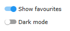
The check box control will be rendered as a switch button. In the 'On' state, the control is rendered in the primary material color with the switch in the right position. In the 'Off' state, a checkbox will render in gray with the switch to the left. When the TriState property is also enabled, a switch in an indeterminate state will render in the secondary material color with the switch in the middle position. |
|
|
False |
(Default) The check box control will be rendered as an interactive box. When the TriState property is also enabled, a checkbox in an indeterminate state will render in the secondary material color with a dash in the box. |
|


Switch buttons should be used sparingly in your application, and only when the context is appropriate. Refer to the following guidelines when considering whether to use a checkbox or switch.
Switches: are for instantaneous actions.
Use a Switch when,
- The control represents an immediate on/off or show/hide function.
- The user is performing an instantaneous action that does not require a further action, like clicking a button, to be applied.
- The user is toggling independent features or behaviors.
|
|
|
|
Options that represent on/off states are best shown using a switch. |
Use switches for instantaneous actions. |
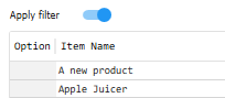
Checkboxes: allow a user to make one or more selections, which are not applied until the user confirms them via some other action.
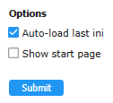
Use a check box when,
- Multiple options are available and the user has to select one or more from them.
- The user has to perform additional steps for changes to become effective, for instance clicking a Submit or OK button. This provides the user with the opportunity to review their selections before they are applied.
- The form needs to display a list containing sub-selections. This allows for easy selection or deselection of all items with a parent checkbox. In addition, the parent checkbox's intermediate state can indicate that one or more sub-options (but not all of them) are selected in the list.
|
|
|
|
Checkboxes are preferred when an explicit action is required to apply settings. |
Indeterminate states are best shown using a checkbox. |

Where possible, switches and checkboxes should not be used in the same form as this can be confusing for users.
See Also
Color settings | Material skin
Applies To
© 2004-2021 looksoftware. All rights reserved.