Check Box Control

A control that indicates a binary condition.
Client support
 Newlook Smartclient
 Newlook Server
Use
A CheckBox control allows the end user to toggle an option on or off. The control displays a tick when selected; the tick disappears when the check box is cleared.
Checkbox and Option button controls function similarly but with an important difference; any number of check box controls on a form can be selected at the same time. In contrast, only one option button in a defined group can be selected at any given time.
Host generated check boxes
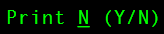
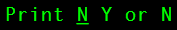
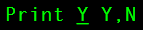
A check box control is automatically generated in the GUI whenever the Newlook recognition engine detects a host entry field associated with two field choice values (i.e. Y,N), and those values are listed as check field choices in Check Field Rules.
When a check box is automatically generated, its Choices property will specify the selected and unselected values that will be sent back to the host.
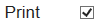
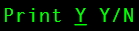
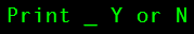
For example, the following screen elements will all result in the automatic generation of a check box control:
|
|
||
|
|
||
|
|
||
|
|
||
|
|
You can assist the recognition engine to automatically generate check boxes by adding custom choice values to Check Field Rules and/or manually adding field choices after the associated entry field in Identify.
Inserted check boxes
A custom checkbox control can be inserted on your form to capture additional boolean data or provide a buddy control for an existing entry field. See Common checkbox tasks below.
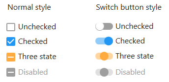
Material skin considerations
When the material skin is enabled in your solution, you have the option to display checkboxes in the normal style or as switch buttons (set the UseSwitchButton Property to true). Checkboxes will render in the material primary color when selected and the secondary color when in the indeterminate state (for tri-state checkboxes).
|
Material skin |
Classic skin |
|
|
|
 Common Check Box Tasks
Inserting a custom checkbox control
- Open the relevant screen
in Design mode (
 )
.
)
. - Select Insert | CheckBox ()
from the main menu, then use your cursor to draw the graphic area on the
screen.
- Set the Caption property of the control in the properties pane and enter a descriptor for the checkbox field.
- Configure the Choices property to specify the value the control will return in its checked and unchecked state. See section below for more information on how to specify field choice values.
- Set the Value property to initialize the control. If the Choices property has been specified, then the value should be set to one of the specified choices. Where the Choices property has not been set, a value of 0 represents an unchecked state, 1 represents the checked state, and 2 is the indeterminate state (for tri-state check boxes).
Creating a tri-state checkbox
|
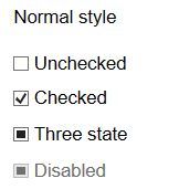
A check box can have three states: checked, un-checked and unknown, or two states: checked and un–checked. By default checkboxes will be generated as two-state check fields unless the global 3-state check box option is turned on in Rules, OR the Tri-state property on an individual check box is set to True in Designer. If the global tri-state option is turned on, three-state check boxes will be automatically generated from host fields if two defined values are detected, and the corresponding entry field also allows a blank. Tri-state check boxes can be grayed (filled) as well as checked or unchecked. The grayed state is used to show that the state of the check box is unknown. Note: A 3-state check box may be required, where there is a need to enter a blank value in the field, in addition to the standard boolean choices. |
Specifying field choices for inserted check boxes
An inserted check box control's field choices can be set via the Choices property in Designer or via a SetValue script or macro at run-time.
A semicolon should separate the checked and unchecked values, as follows:
<Checked value>;<Unchecked value>
For example, the following script specifies that Paid and Unpaid are the values for the checkBox control's checked and un-checked state:
App.ActiveForm.chMyCheckBox.Choices = "Paid;Unpaid";
The Value property can be used to set its initial state at design time, or return the current state of the control at runtime.
Binding the control to a buddy control
Binding a check box control to a buddy involves linking it with another control on the form, which will be used to display the value and/or send the value through to the host.
For example, assume you have an entry field at position 5,35, which accepts two values, Sighted and Unsighted. To simplify data entry for your users, you provide them with a new check box control on the form to record this data. However, you will need to bind this check box to the original entry field so the value is sent back to the host from the correct field. To do this:
- In Designer, insert a check box control and set its Choices property to Sighted;Unsighted.
- Set its BuddyControl property to reference the original entry field. This can be done one of two ways; either specify the Name of the control OR, if the control is a host field, the Row and Column position of the control. If specifying the row and column position of the host field, the co-ordinates must be specified as follows: row, column. In this example we would set it to 5,35.
- Set the BuddyProperty property to the property of the buddy control that we want to synchronize the checkbox value with. In our current example, assuming that the original entry field is a text box, the BuddyProperty would be set to Text, as it is the text property of this control that we want to synchronize with the value of the check box.
- If an Aid key is to be sent to the host along with the value of this control (i.e. the Enter key) then select the relevant key from the BuddyKey property drop down.
- Set the BuddyValue property to the checked;unchecked choices for the check box control. In this example, we would set it to Sighted;Unsighted. Note that the BuddyValue property is set differently for checkboxes than for other controls. Specifying the check box field choices, ensures that the value sent through to the buddy control is translated into the correct string.
Properties
Newlook Smartclient | Newlook Server |  Deprecated
|
Deprecated
|  Obsolete
|
Property |
Client |
Description |
|
|
Gets or sets the grid column that this control is aligned to. Design-time only. Not available at run-time. |
|
|
|
Gets or sets the background color of the object. |
|
|
|
Gets or sets a style which determines if the control's background is transparent or opaque. |
|
|
|
Gets or sets whether the caption of the control blinks. |
|
|
|
Gets or sets the control's border color. |
|
|
|
Gets or sets the style of a control's border. |
|
|
|
Gets or sets the width (thickness) of the control's border. |
|
|
|
Gets or sets the control used as the buddy control. |
|
|
|
Gets or sets the AID key to be sent from the buddy control. |
|
|
|
Gets or sets the property of the buddy control that is to be modified. |
|
|
|
Gets or sets the value that is to be passed to the buddy control. |
|
|
|
Gets or sets the caption text of the control. |
|
|
|
Gets or sets the Coded Character Set Identifier (CCSID), which defines the control's code page and character set. |
|
|
|
Gets or sets the available choices for this object. |
|
|
|
The green screen column coordinate that marks the beginning of the object. Read only. Host generated controls only. |
|
|
|
Gets or sets the CSS class, or classes, for the control in Newlook Server. Server-only. |
|
|
|
Gets or sets the enabled state of the object. |
|
|
|
Gets or sets whether text should be shown in a bold font. |
|
|
|
Gets or sets whether text should be shown with an italic style. |
|
|
|
Gets or sets the name of the font family used to display text. |
|
|
|
Gets or sets the font point size used to display text. |
|
|
|
Gets or sets whether text should be diplayed underlined. |
|
|
|
Gets or sets the foreground (text) color of the control. |
|
|
|
Sets or returns the current control index for an object. |
|
|
|
Returns or sets the height of the object's size in pixels at default size, which is the object's size at design-time. |
|
|
|
Determines the distance, in pixels, between the left edge of the control and the left edge of its form or parent container at default size, which is the object's size at design-time. |
|
|
|
Gets or sets the name of this object. |
|
|
|
Gets or sets the name of the macro or script to be run when the Change event is triggered. |
|
|
|
Gets or sets the name of the macro or script to be run when the Click event is triggered. |
|
|
|
Gets or sets the name of the macro or script to be run when the GotFocus event is triggered. Smartclient-only property. |
|
|
|
Gets or sets the name of the macro or script to be run when the LostFocus event is triggered. Smartclient-only property. |
|
|
|
Gets or sets the referenced field name for fields associated with an external host file. Open Display Files-only. |
|
|
|
The green screen row coordinate that marks the beginning of the object. Read only. Host generated controls only. |
|
|
|
Gets or sets a value which determines the control's tab order. |
|
|
|
Gets or sets whether the Tab key can be used to set focus to the control. |
|
|
|
Gets or sets user defined information for the control. |
|
|
|
Gets or sets whether the control will recieve focus when the user clicks on it. |
|
|
|
Gets or sets the text style of the control. |
|
|
|
Gets or sets the control's tool-tip text. |
|
|
|
Determines the distance, in pixels, between the top edge of the control and the top edge of its form or parent container at default size, which is the object's size at design-time. |
|
|
|
Gets or sets a value which allows the check box to have an indeterminate state. |
|
|
|
Returns a value which specifies the control's type. Read only. |
|
|
|
Gets or sets whether the control's keystroke mnemonic is embedded within the text. |
|
|
|
Gets or sets a value that determines whether a checkbox will render as a switch button instead of the traditional box. Design-time only. Material skin only property. |
|
|
|
Gets or sets the state of the control. |
|
|
|
Gets or sets the name of the variable that stays synchronized with the contents of the control. |
|
|
|
Gets or sets whether the control, object or form is visible or hidden. |
|
|
|
Gets or sets the width of the object in pixels at default size, which is the object's size at design-time. |
See Also
Option button control | Combo box control