Combo Box Control

A combo box is an entry-capable control which contains a drop down list of available entry options.
Client support
 Newlook Smartclient
 Newlook Server
Use
This control combines the features of a TextBox control and drop down list — users can enter information in the text box or select an item from the list portion of the control. Alternatively, if you want to restrict entry to just the items in the drop down list, changing the Style property to ComboDropDownList, will disable the text entry portion of the control and restrict entry to items on the drop down list.
Host generated combo boxes
A combo box control is automatically generated in the GUI whenever the recognition engine detects an entry field associated with multiple field choice values on the host screen. A command combo box control is generated when the recognition engine identifies a command entry field on the screen.
Combo vs Option button recognition
In choosing whether a combo box or option buttons will be generated, the Newlook recognition engine will try to determine if the field choice values associated with the entry field are a complete set of options or not. If there is some indication that additional values will be accepted in the field, then a combo box will be generated. Examples of this include: options that are inconsistent, the more keyword or the ... characters. If the recognition engine identifies a complete set of field choice values, then option buttons will be generated.
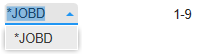
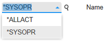
The following are a small example of the types of screen element combinations that will result in the automatic generation of a combo box control:

|
|
|

|
|
It is possible to specify various configuration rules which govern how combo boxes are generated, and what will be displayed in them. Refer more information on additional configurations, refer to the Combo Field Options topic.
Inserted combo box controls
Combo box controls are useful when you need to provide multiple options to the user, without taking up too much space on the screen.
Combo box vs list box
When the Style property of a combo box control is set to ComboDropDownList, user entry is restricted to items in the drop down list. Therefore its functionality is very similar to that of a list box control. The main difference is that, in a combo box, the full list is displayed in a drop down when the user clicks the down arrow. In a list box control, the items are displayed within the control and the user must scroll through the available choices. Therefore, if you want users to see the full list in a list box control, you need to size the control so that they are all visible.
A combo box is the logical choice when you need to provide a list of suggested choices but you do not want to restrict the user to this selection. When the Style property is set to ComboDropDown, the combo box is rendered with an editable text area, so choices not in the list can be typed into the field.
In addition, combo boxes save space on a form. Since the full list is not displayed until you click the down arrow, a combo box can easily fit in a small space where a list box would not fit.
Material skin considerations
When the material skin is enabled in your solution, combo boxes will be rendered with material styling. The most noticeable difference is the increase in spacing between list items. this may mean that your lists are longer than they are with the classic skin.
|
Material skin |
Classic skin |
|
|
|
 Common Combo Box Tasks
Inserting a ComboBox Control
- Open the relevant screen
in Design (
 )
mode.
)
mode. - Select Insert | ComboBox ()
from the main menu, then use your cursor to draw the graphic area on the
screen.
- Select the appropriate Style to determine how the control will display (see next section).
- Configure the List property to determine the items that will appear in the control's drop down list (see "Specifying the list array" section below).
- Set the Text property to initialize the control (if required).
Setting the ComboBox style
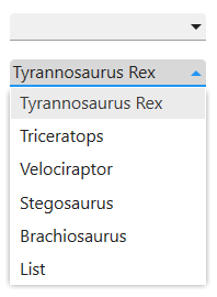
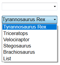
There are two ways of displaying data in a ComboBox, ComboDropDown and ComboDropDownList. Either can be set via the Style Property:
|
ComboDropDown With the default setting, it is can possible to enter text directly into the text box portion of the control or click the arrow to the right of the combo box to open a list of choices. Selecting one of the choices places the value into the text portion of the combo box. You also can open the list by pressing ALT+DOWN ARROW when the control has the focus. |
|
ComboDropDownList The ComboDropDownList style generates a control which is similar to a list box. It contains a list of items which users must choose from. Unlike the list box control, however, the list is displayed in a drop down when the arrow is clicked. Use this type of list box when space is at a premium and the list of options is known. |
Specifying the List array in Designer
A combo box control's list can be set either in Design via the List property or dynamically via a macro or script (see below).
The list item string may be an array of value and descriptions or values only. It can also be an expression.
If you have Openlook installed on your IBM i, it is also possible to use the SQL function in an expression to return the results of a query on a host file.
|
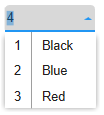
If you wish to display both values and descriptions in the drop down list then the string must include the value and description separated by an equals (=) character. For example: 1=Select;2=All;3=Enter; The value and the description will then be shown in separate columns in the list. When an item is selected in a Combo box, the value is entered into the Text box portion of the control. |
|
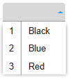
If you wish to just display a list of values without a description then the string will consist of semi-colon delimited values. For example: Select;All;Enter The values will be displayed in the drop down list. |
For more detailed information on creating the list item array refer to the List Property topic.
Dynamically creating, appending and removing items from the list array
A combo box control's list item array can be dynamically modified using a SetValue Action in the macro editor to set the List property or by using the AddItem, RemoveItem or Clear methods in a script.
For example, the following macro populates the combo box's list with four items:
SetValue (cmbTest.List, "Option 1;Option 2;Option 3; Option 4;")
Specifying a list index of -1 allows you to append an item to the list item array. The following macro adds the item "Option 5" to the existing control's list:
SetValue (cmbTest.List(-1), "Option 5")
The index of any new item added can be returned via the NewIndex Property.
Sorting list items
You can specify that items be displayed in the list in alphabetical order by setting the Sorted Property to True. The sort is not case sensitive: thus, the words "sort" and "Sort" are treated the same.
Note that if you list array contains values and descriptors, then turning the Sorted property on, will sort the list by value.
After sorting, the index of items in the list will change to reflect their new position in the list. The NewIndex Property can be used to determine the index of any items dynamically added to a sorted list. Any items that are added subsequently will have an index that corresponds to their sorted position in the list. Keep in mind that this control uses a 0-based index.
Referencing list item array elements
The List property provides access to all items in the list. It contains an array in which each item in the list is an element of the array. Each item is represented in string form. To refer to an individual item in the list, use this syntax:
App.ActiveForm.Control.List(Index)
where Control is the combo box, and Index is the position of the list item within the array.
The combo box list array uses a zero-based index therefore the top item has an index of 0; the next item has an index value of 1, and so on. For example, the following code inserts the third item (index = 2) of a ComboBox list into a textbox called txtMyTextBox:
App.ActiveForm.txtMyTextBox.Text = App.ActiveForm.cmbMyComboBox.List (2)
Determining the currently selected item
The Text property corresponds to whatever is entered in the text box portion of the control at run-time. This can be either a selected list item or a string that is typed into the text box portion of the control or the unchanged default text. Where a combo box control has been automatically generated from a host screen, the Text Property is populated with the string that is present in the underlying host field. In this case, the text will be appended to the combo drop down list and automatically selected when the control is generated.
The ListIndex Property returns the index of the currently selected item. If no item is selected, the ListIndex property returns -1.
Properties
Newlook Smartclient | Newlook Server |  Deprecated
|
Deprecated
|  Obsolete
Methods
Newlook Smartclient Newlook Server Deprecated.
|
Method |
Client |
Description |
|
|
Adds a new item to the list of values displayed. |
|
|
|
Clears the contents of the specified object. |
|
|
|
Removes an existing item from the list of values displayed. |
See Also
Combo field Rules | Command combo Settings
© 2004-2021 looksoftware. All rights reserved.