Text Box Control

Text boxes are versatile controls that can be used to receive input or alternatively, display text.
Client support
 Newlook Smartclient
 Newlook Server
Use
Since they allow their contents to be modified, text boxes should not be used to display text that should not be changed at run-time.
Text boxes can be single line and multiline.
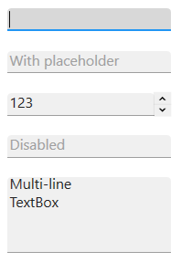
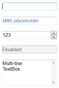
Material skin considerations
When the material skin is enabled in your solution, text boxes will be rendered according to material principles. The most noticeable difference is that they render without top or side borders. When a text box has focus it is underlined in the material primary color. There is no change to the behavior of this control or any supported properties.
|
Material skin |
Classic skin |
|
|
|
 Common TextBox Tasks
Inserting a textbox control
- Open the relevant screen
in Designer (
 )
mode.
)
mode. - Select Insert|Textbox ()
from the main menu, then use your cursor to draw the graphic area on the
screen.
- With the label selected, select the Text field in the Properties pane and enter the text to display.
- Set any other relevant properties in the Properties pane. For more information on text box properties refer to the properties section of the text box reference topic.
Dynamically updating the text in a label control
An inserted textbox control's text component can be set via the Text property in Designer or via a script or SetValue macro at run-time.
For example, the following macro changes the caption of the Status textbox to "SYSTEM UPDATE COMPLETE":
SetValue (txtStatus.Text, "SYSTEM UPDATE COMPLETE")
Binding a textbox to a data control
A textbox control may be used to display fields from an external database when used in conjunction with a Data control. The inserted data control provides the connection to the database while the textbox controls are used to display that data and allow the user to edit it.
There are two properties which need to be set on a textbox control to bind it to a data control: DataSource and DataField. The DataSource property should be set to the name of your data control, while the DataField property should be set to the name of the field in the database which you want to display in the control. These properties can be set statically in Designer or dynamically via a script or macro using the SetValue method or action.
Using quotation marks in textboxes
Sometimes quotation marks are required in a text string. For example, let's say you wish to display the following in a text box:

Entering this text statically via Designer is simple, we can include the quotation marks as Designer is expecting a string however if we want to set this string dynamically using a macro or script we run into problems.
To display quotation marks in a macro you must insert an additional two sets of quotation marks. For example:
SetValue (App.ActiveForm.txtDisplay.Text, """Hello World""")
Alternatively, you can use the ASCII character (34) to display a quotation mark:
SetValue (App.ActiveForm.txtDisplay.Text, "" & Chr(34) & "Hello World" & chr(34) "")
The same is true for vbscript, we need to can insert two additional quotation marks. For example:
App.ActiveForm.txtDisplay.Text = """Hello World"""
Or we can use the ASCII character (34):
App.ActiveForm.txtDisplay.Text = "" & Chr(34) & "Hello World" & Chr(34) & ""
In JScript, we need to use the escape character to indicate that we are using a literal character:
App.ActiveForm.txtDisplay.Text = "\"Hello World\""
Multiline textboxes
Setting the Multiline property to True allows a text box to accept or display multiple lines of text at run-time. Multiline text boxes automatically manage word wrap. Automatic word wrap saves the trouble of inserting line breaks at the end of lines. When a line of text is longer than what can be displayed on a line, the text box wraps the text to the next line.
Within a macro, you can force a line break by inserting the newline ASCII character (13):
SetValue (App.ActiveForm.txtDisplay.Text = "This message has multiple lines." & Chr (13) & "This is the second line."
Within a VBScript, you use similar syntax:
App.ActiveForm.txtDisplay.Text = "This message has multiple lines." & Chr(13) & "This is the second line."
Within JScript, you use the new line character:
App.ActiveForm.txtDisplay.Text = "This message has multiple lines." + '\n' + "This is the second line.";
Password and restricted length textboxes
A password text box allows the user to type characters into the control while displaying the placeholder character. Two properties, PasswordChar and MaxLength, makes it easy to create a password text box.
When the PasswordChar property is set to True, regardless of what characters are typed in the text box, the placeholder character is displayed.
MaxLength determines how many characters can be typed into the text box. After MaxLength is exceeded, the text box beeps and does not accept any more characters.
Properties
Newlook Smartclient | Newlook Server |  Deprecated
|
Deprecated
|  Obsolete
|
Property |
Client |
Description |
|
|
Gets or sets the grid column that this control is aligned to. Design-time only. Not available at run-time. |
|
|
|
Returns or sets a value that determines the alignment of text in a control, values in a column of a data grid control, values in the column header of a list view control or tabs in a tab control. |
|
|
|
Gets or sets the background color of the object. |
|
|
|
Gets or sets the Coded Character Set Identifier (CCSID), which defines the control's code page and character set. |
|
|
|
The green screen column coordinate that marks the beginning of the object. Read only. Host generated controls only. |
|
|
|
Gets or sets the CSS class, or classes, for the control in Newlook Server. Server-only. |
|
|
|
Gets or sets the name of a field within a data source to be displayed in this object. |
|
|
|
Gets or sets the name of the data source for the control. |
|
|
|
Sets or returns the format used to display the contents of the control. |
|
|
|
Gets or sets a value which determines whether new lines should be inserted to match host line breaks (Multi-line entry fields only). |
|
|
|
Gets or sets the enabled state of the object. |
|
|
|
Gets or sets whether text should be shown in a bold font. |
|
|
|
Gets or sets whether text should be shown with an italic style. |
|
|
|
Gets or sets the name of the font family used to display text. |
|
|
|
Gets or sets the font point size used to display text. |
|
|
|
Gets or sets whether text should be diplayed underlined. |
|
|
|
Gets or sets the foreground (text) color of the control. |
|
|
|
Gets or sets the data type format which determines which characters are allowed for user input. |
|
|
|
Sets or returns the current control index for an object. |
|
|
|
Returns or sets the height of the object's size in pixels at default size, which is the object's size at design-time. |
|
|
|
Gets or sets a type of HTML5 input type element for the control. Server-only. |
|
|
|
Determines the distance, in pixels, between the left edge of the control and the left edge of its form or parent container at default size, which is the object's size at design-time. |
|
|
|
Gets or sets the maximum number of characters that will be sent back to the host. |
|
|
|
Gets or sets a value indicating whether text in the control can span more than one line. |
|
|
|
Gets or sets the name of this object. |
|
|
|
Gets or sets the name of the macro or script to be run when the Change event is triggered. |
|
|
|
Gets or sets the name of the macro or script to be run when the Click event is triggered. |
|
|
|
Gets or sets the name of a macro or script to be run when the DblClick event occurs. |
|
|
|
Gets or sets the name of the macro or script to be run when the GotFocus event is triggered. Smartclient-only property. |
|
|
|
Gets or sets the name of the macro or script to be run when the LostFocus event is triggered. Smartclient-only property. |
|
|
|
Gets or sets the replacement display character used when entering passwords. |
|
|
|
Gets or sets a short hint (a word or short phrase) intended to aid the user with data entry when the control has no value. |
|
|
|
Gets or sets the read-only status of the control. |
|
|
|
Gets or sets the referenced field name for fields associated with an external host file. Open Display Files-only. |
|
|
|
The green screen row coordinate that marks the beginning of the object. Read only. Host generated controls only. |
|
|
|
Gets or sets whether spell checking will be enabled for text in the control. |
|
|
|
Gets or sets a value which determines the control's tab order. |
|
|
|
Gets or sets whether the Tab key can be used to set focus to the control. |
|
|
|
Gets or sets user defined information for the control. |
|
|
|
Gets or sets the current value of the control or object. |
|
|
|
Gets or sets the control's tool-tip text. |
|
|
|
Determines the distance, in pixels, between the top edge of the control and the top edge of its form or parent container at default size, which is the object's size at design-time. |
|
|
|
Returns a value which specifies the control's type. Read only. |
|
|
|
Gets or sets a value which determines whether user entered text is converted to uppercase. |
|
|
|
Gets or sets the name of the variable that stays synchronized with the contents of the control. |
|
|
|
Gets or sets whether the control, object or form is visible or hidden. |
|
|
|
Gets or sets the width of the object in pixels at default size, which is the object's size at design-time. |
See Also
© 2004-2021 looksoftware. All rights reserved.