Option Button Control

An option button displays an option that can be turned on or off.
Client support
 Newlook Smartclient
 Newlook Server
Use
Option buttons (also known as radio buttons) are useful when you want to restrict the user selection to only one choice from a group of options.
Checkbox and option button controls function similarly but with an important difference; any number of check box controls on a form can be selected at the same time. In contrast, only one option button in a group can be selected at any given time.
Host generated option buttons
A group of option buttons is automatically generated in the GUI whenever the Newlook recognition engine detects an entry field associated with a defined set of field choice values on the host screen.
Combo vs option button recognition
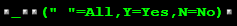
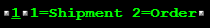
In determining whether a combo box or option button will be generated, the Newlook recognition engine will try to determine if the field choice values provided on the host screen are a complete set of options or not. If there is some indication on the host screen that additional values will be accepted in the field, for instance the options are inconsistent, the more keyword is provided or the ... character then a combo box control will be generated. If the recognition engine identifies the field choice value selection as a complete set then option buttons will be generated.
The following are a small example of the types of screen element combinations that will result in the automatic generation of a group of option buttons:
|
|
|
|
All automatically generated option buttons have their BuddyValue, BuddyControl and set so that they are sending the correct value to the relevant host entry field when selected. If the underlying host screen contains both FieldChoiceValues and FieldChoiceDescriptions then the description will be stored in the Text property and the value will be stored in the BuddyValue property.
Inserted option button controls
Usually, option buttons are used as part of an option group to display multiple choices from which the user can select only one. You can group option buttons by drawing them inside a frame, panel, Tab or directly on a window. All option buttons within a container, such as a frame, are treated as a group. Option buttons on a window are also treated as a separate group from any option buttons in a container.
The GroupStart property can be used to create multiple independent groups of option buttons. Set the GroupStart property to True for the first option button in each group.
TIP!
To display text next to the option button, set the Caption property. Use the Value property to set or determine the state of the control—selected (1) or unselected (0).
Material skin considerations
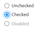
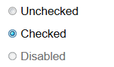
When the material skin is enabled in your solution, option buttons will be rendered with material styling. The most noticeable difference is a change in styling when the button is selected. There is no change to the behavior of this control or any supported properties.
|
Material skin |
Classic skin |
|
|
|
 Common Option Button Tasks
Inserting an Option Button Control
- Open the relevant screen
in Design (
 )
mode.
)
mode. - Insert the required number of option buttons by selecting Insert|OptionButton ()
from the main menu.
- Set the Caption property to enter the display text for each button.
- Select the first option button in the group and set the GroupStart property to True. This identifies this control and any subsequent option buttons as belonging to the same group and hence only one option button in the group can be selected by a user. This is important if you have more than one group of option buttons on a form.
- If you want an option to be pre-selected when the form opens, set that option button's Value property to 1.
- Set any other relevant properties in the Properties pane. For more information on option button properties refer to the relevant section in the option button reference topic.
Grouping Option Buttons on a frame to work together
- Insert a frame control on your form.
- Insert the option buttons that you wish to group together on the frame and set their Caption property.
- Decide which option button should be the default selection when the form is opened and set it's Value property to
1. - Set the GroupStart property of the first option button in the group to True. This property tells Newlook where the group begins so that user navigation is restricted to one option button per group.
- Assign a relevant script or macro to the OnChange event of each of the relevant option buttons if you wish to respond to user input.
Determining which button has been pressed
The simplest way of determining which option button has been pressed by a user is to assign the following one-line script to the OnClick property of each option button in the group (this could be done in a macro also of course):
App.SetValue ("clickedControl", "App.ActiveForm.ActiveControl.Name");
This script simply assigns the name of the active control to a variable which you can then use for validation or any other purposes. Note, you'll need to remove the semicolon (;) from the end of the line if you are running a VB script.
Properties
Newlook Smartclient | Newlook Server |  Deprecated
|
Deprecated
|  Obsolete
|
Property |
Client |
Description |
|
|
Gets or sets the grid column that this control is aligned to. Design-time only. Not available at run-time. |
|
|
|
Gets or sets the background color of the object. |
|
|
|
Gets or sets a style which determines if the control's background is transparent or opaque. |
|
|
|
Gets or sets whether the caption of the control blinks. |
|
|
|
Gets or sets the control's border color. |
|
|
|
Gets or sets the style of a control's border. |
|
|
|
Gets or sets the width (thickness) of the control's border. |
|
|
|
Gets or sets the control used as the buddy control. |
|
|
|
Gets or sets the AID key to be sent from the buddy control. |
|
|
|
Gets or sets the property of the buddy control that is to be modified. |
|
|
|
Gets or sets the value that is to be passed to the buddy control. |
|
|
|
Gets or sets the caption text of the control. |
|
|
|
Gets or sets the Coded Character Set Identifier (CCSID), which defines the control's code page and character set. |
|
|
|
The green screen column coordinate that marks the beginning of the object. Read only. Host generated controls only. |
|
|
|
Gets or sets the CSS class, or classes, for the control in Newlook Server. Server-only. |
|
|
|
Gets or sets the enabled state of the object. |
|
|
|
Gets or sets whether text should be shown in a bold font. |
|
|
|
Gets or sets whether text should be shown with an italic style. |
|
|
|
Gets or sets the name of the font family used to display text. |
|
|
|
Gets or sets the font point size used to display text. |
|
|
|
Gets or sets whether text should be diplayed underlined. |
|
|
|
Gets or sets the foreground (text) color of the control. |
|
|
|
Sets or returns the current control index for an object. |
|
|
|
Returns or sets the height of the object's size in pixels at default size, which is the object's size at design-time. |
|
|
|
Determines the distance, in pixels, between the left edge of the control and the left edge of its form or parent container at default size, which is the object's size at design-time. |
|
|
|
Gets or sets the name of this object. |
|
|
|
Gets or sets the name of the macro or script to be run when the Change event is triggered. |
|
|
|
Gets or sets the name of the macro or script to be run when the Click event is triggered. |
|
|
|
Gets or sets the name of a macro or script to be run when the DblClick event occurs. |
|
|
|
Gets or sets the name of the macro or script to be run when the GotFocus event is triggered. Smartclient-only property. |
|
|
|
Gets or sets the name of the macro or script to be run when the LostFocus event is triggered. Smartclient-only property. |
|
|
|
Gets or sets the referenced field name for fields associated with an external host file. Open Display Files-only. |
|
|
|
The green screen row coordinate that marks the beginning of the object. Read only. Host generated controls only. |
|
|
|
Gets or sets a value which determines the control's tab order. |
|
|
|
Gets or sets whether the Tab key can be used to set focus to the control. |
|
|
|
Gets or sets user defined information for the control. |
|
|
|
Gets or sets whether the control will recieve focus when the user clicks on it. |
|
|
|
Gets or sets the text style of the control. |
|
|
|
Gets or sets the control's tool-tip text. |
|
|
|
Determines the distance, in pixels, between the top edge of the control and the top edge of its form or parent container at default size, which is the object's size at design-time. |
|
|
|
Returns a value which specifies the control's type. Read only. |
|
|
|
Gets or sets whether the control's keystroke mnemonic is embedded within the text. |
|
|
|
Gets or sets the state of the control. |
|
|
|
Gets or sets the name of the variable that stays synchronized with the contents of the control. |
|
|
|
Gets or sets whether the control, object or form is visible or hidden. |
|
|
|
Gets or sets the width of the object in pixels at default size, which is the object's size at design-time. |
See Also
© 2004-2021 looksoftware. All rights reserved.