Tab Control

A Tab control allows you to create multiple pages of data on a single screen.
Client support
 Newlook Smartclient
 Newlook Server
Use
This control is particularly useful when you need to simplify busy host screens, visually group similar items of data or combine the information on multiple screens onto a single screen.
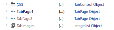
A Tab control consists of one or more TabPage objects in a TabPages collection. You can add, edit or remove TabPages via the TabPages collection editor. Click the prompt button next to the TabPages property to open the Editor. You can change the appearance and behavior of the control and each tab page by setting it's properties. For example, you can associate an ImageList control with the Tab control, and then specify the image to be used on each individual tab page via the ImageIndex property. To add controls to a tab page you can either drag and drop existing host controls onto the relevant tab page or insert new controls.
Material skin considerations
When the material skin is enabled in your solution, tab controls will be rendered according to material design principles. The most noticeable difference is that the default tab control no longer has a border around it. When selected, tab button text will render in the material primary color, unless you specify otherwise.
The following command button properties are ignored when the material skin is enabled: HoverColor Property and SelectedForeColor Property. In addition, for the Alignment Property, only top and bottom are currently supported.
|
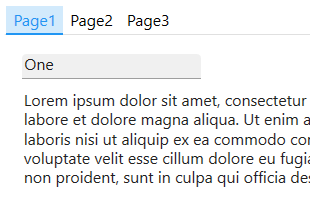
Material skin |
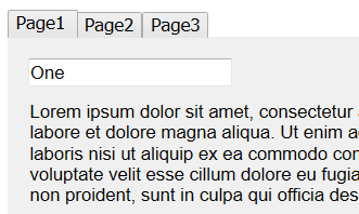
Classic skin |
|
|
|
 Common Tab Control Tasks
Inserting a Tab control
- Open the relevant screen in Designer (
 ) mode.
 - Select TabControl
() from the control toolbox, then use your cursor to draw the control's graphic area on the
screen.
- By default, the control will be created with a single Tab Page. Click the Add button (
 ) to the far right of the tab buttons to add additional Tab Pages. Alternatively you can click the prompt button next to the TabPages property to open the Tab Pages Editor and add pages there.
 - Add as many tab pages as is necessary. For each tab page that is created, Newlook creates an associated tab page object which is added to the tab pages collection.
- If required, select each tab page by clicking a specific tab button in the control and modifying any relevant properties i.e. Back color, Button Colors and name etc. For more information on available tab properties refer to the Tab Pages property reference topic.
- Manually select the parent Tab control object by clicking in the space to the far right of the tab buttons and modify the properties of the control if necessary.
Inserting controls onto tab pages
- In the Tab control, select the first tab button to select that tab page.
- Either drag and drop existing controls onto the tab page or select Insert | Control from the File menu and draw the relevant control area on the tab page area. Set any relevant properties for the inserted control as necessary.
- Repeat the above step until you have inserted all the controls for this tab page.
- Select the second Tab button (note that the button will appear in a different color once selected) and insert controls for this tab page.
- Repeat the above steps for all the tab pages.
Responding to user actions
There are various properties which allow you to respond to user actions in the Tab control. Each individual tab page has an OnClick property which allows you to run a macro or script when the tab page is clicked. In addition, the tab control has an OnSelChanging property which allows you to run code when a user selects a different tab page, but before the new page is loaded. This is useful if you are needing to perform validation on the page the user is about to leave. The OnSelChanged property is similar but allows you to run code after a user has selected a different tab page. Use this property to perform any pre-display processing on the page the user is navigating to.
Assigning images to a tab control
|
It is possible to assign images to both the tab page area of the tab control and also to the tab buttons. To specify an image to display in the tab page area you need to set the Picture property for that individual tab page. To assign a default image, an image when the tab is selected and an image that is displayed when the user hovers over the tab button you need to first insert an imageList Control on your form and then associate it with your Tab control via the ImageList property. You can then set the index of the image you wish to display in the ImageIndex, SelectedImageIndex and HoverImageIndex properties respectively. |
NOTE
It is important to note that Newlook uses relative file paths therefore any custom images that you assign to menu controls must be deployed with your Newlook solution files to end users in the same relative location. It is recommended that you create an Images folder within your solution directory which contains all custom images used in your solution. This solution folder can then be deployed to end users and all relative paths remain intact.
Referencing individual tab pages
|
Individual tab pages are treated as separate child controls of the tab control within the Newlook object model. For example, if you insert a tab control onto your form with three tab pages, in Inspector you will see the tab control as one object and the three tab pages as separate objects underneath that. Adding a tab control will add 1 + x controls to the total control count for the form (where x is the number of tab pages in your tab control). If you wish to dynamically update a property of a tab page via a script of macro you can either reference the tab page using its index in the tab pages collection of the parent tab control: App.ActiveForm.tabControl.TabPages.TabPageIndex.Caption or, you can reference the tab page directly using it's name: App.ActiveForm.tabPageName.Caption |
Reordering tab pages
Tab pages can be reordered by dragging them and dropping them to the appropriate position within the control itself. Alternatively, open the Tab Pages Collection Editor via the TabPages property of the Tab object and use the up and down buttons to specify the position of your tab pages.
Properties
Newlook Smartclient | Newlook Server |  Deprecated
|
Deprecated
|  Obsolete
Methods
None.
See Also
TabPage object | TabPages collection
© 2004-2021 looksoftware. All rights reserved.