ImageList Control

An image list control acts as a container for a collection of image references. It is used in conjunction with other controls to supply them with images.
Client support
 Newlook Smartclient only.
Use
Each image in the Images collection of an image list control has an index and can be referenced by this index. Newlook controls that use the ImageList control include DataGrid control, Tab control, TreeView control and ListView control.
The ImageList control supports SVG, PNG, JPEG, GIF (including animated GIFs), BMP and ICO file types.
 Common image list tasks
Inserting an image list control
- Open the relevant screen
in Designer (
 )
mode.
)
mode. - Select Insert | ImageList ()
from the main menu, then use your cursor to insert the control on the
screen. Note that the ImageList control itself will not be visible in the resulting GUI, it is simply a container control so its size is irrelevant.
- Specify a the Name for your image list control. You will need to give this control a name if you wish to bind it to any other controls on your form.
- Use the Images property to open the Files Editor and add images to the control's collection (see below).
- Specify the ImageHeight and ImageWidth properties to set the display size for images in the collection.
Adding and removing images to the image collection
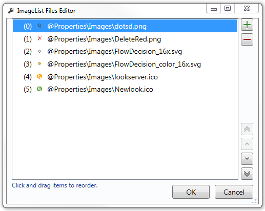
- Select the image list control on your form and click on the prompt button next to the Images property. The ImageList Files Editor will open.
- Click the Add (
 ) button to open a file browsing window and select the image you wish to add to the Images collection. It is important to note that Newlook uses relative file paths therefore any images that you add to an image list control must be deployed to end users in the same relative location. It is recommended that you create an Images folder within your solution directory which contains all custom images used in your project. This solution folder can be deployed to end users and all relative paths remain intact.
 - Add as many images to the collection as required.
- To remove images from the collection, select the image in the editor and click the Remove (
 ) button.
 - The index of each image is determined by its order in the collection. Be mindful that if you reorder the images in the editor, the index of the image in the collection will change. To reorder an image in the collection, use the arrow buttons to the right of the collection list or drag and drop an image reference to the desired location.
Setting image size
The size of the image displayed in the bound control is determined by the ImageHeight and ImageWidth properties of the image list control. All images in the collection will be displayed at this size, even if they are larger or smaller.
Binding an image list control to another control
In order to use an ImageList with another control you must bind the ImageList with the second control through a specific property.
- DataGrid control - Use the ImageList property of the DataGrid to bind it to an ImageList control. You can then use the ImageIndex property of the column object to specify the index of the image you want to display as an icon in the column header to the left of the header text, or the ImageIndex property of individual cells to specify the index of the image you want to display as an icon in the specified cell. Before setting the ImageIndex property of a grid cell, you must define the column's Type property as Image. You can either do this at Design-time via the Column collection editor or at runtime via a script or macro.
- ListView control - Use the Icons property to specify the image list you want to associate with the control. When the View property is set to ViewIcon, images will display above each list item, depending on the index specified in the Icon property of each list item. When the View property is set to ViewSmallIcon, ViewList or Report then images will display next to each item in the control.
- Tab control - Use the ImageList property to specify the image list you want to associate with the control. Once specified, you can use the ImageIndex property of individual tab objects to set the index of the relevant default image to display in the tab portion. Use the HoverImageIndex to set the index of the image to display when the user hovers over the tab and the SelectedImageIndex to set the index of the image to display when the user selects the tab.
- TreeView control - Use the Icons property to specify the image list you want to associate with the control. If the Icons property is specified, an image will display next to each node in the tree view. The Icon property of each node specifies the index of the image to display. If you want the icon to change when the user clicks on it then you will need to specify the index of the image to be displayed in the SelectedIcon property of each node.
Properties
Newlook Smartclient |  Newlook Server |
  Deprecated
|
Deprecated
|  Obsolete
See Also
© 2004-2021 looksoftware. All rights reserved.