TabStyle Property
Returns or sets a value indicating how tabs will display in the tab control. Read-only at run-time. Smartclient-only.
object.TabStyle = [value]
Where object is an object expression that evaluates to one of the controls in the Applies To list, and value is a value or constant as described in Settings.
Client support
 Newlook Smartclient only.
Use
This property is used to determine the visual style of tab buttons.
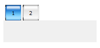
To use the custom TabStyle setting, insert an Imagelist control on your form and populate your image list with tab button graphics. Bind your tab control to the image list control by specifying the name of the image list in the ImageList property of the tab control.
In each individual tab page set the ImageIndex property to the index of the Imagelist object that should appear on the tab for that page.
NOTE:
Many of the BorderStyle values have been obsolete in 11.0. Refer to the table in Settings below.
The available settings for value for this control are :
|
Constant (Macros) |
Constant (Scripts) |
Integer Value |
Example |
Description |
|
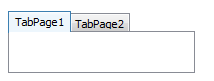
Normal |
nlNormal |
0 |
|
(Default) Display tabs as standard notebook tabs. |
|
Custom |
nlCustom |
3 |
|
Display tabs using images in an associated ImageList control. |
Obsolete values:
|
Constant (Macros) |
Constant (Scripts) |
Integer Value |
Example |
Description |
|
Buttons |
nlButtons |
1 |
|
|
|
FlatButtons |
nlFlatButtons |
2 |
|

See Also
| ImageList property | ImageList control | ImageIndex property
Applies To
© 2004-2021 looksoftware. All rights reserved.