HoverColor Property
Gets or sets the color displayed when the user hovers over the control with a mouse.
 Command button control
Gets or sets the forecolor of text when the user hovers over the control with their mouse.
object.HoverColor = [color]
Where object is an object expression that evaluates to one of the controls in the Applies To list, and value is a value or constant as described in Settings.
Client support
 Newlook Smartclient
 Newlook Server
Skin limitations
 Not supported if Material skin is enabled.
The command button's HoverColor property is ignored if you have the Material skin enabled. Instead, to indicate the hover state the button is rendered with a drop shadow and a lighter shade of the current back color.
Use
This property determines the color of any caption text when the user hovers over the control. It is useful if you want to highlight the button that the user is over.
BE AWARE THAT:
For command button and label controls this property is only applied when the UserHoverColor property for the control is set to True.
Label control
Gets or sets the forecolor of text when the user hovers over the control with their mouse.
object.HoverColor = [color]
Where object is an object expression that evaluates to one of the controls in the Applies To list, and value is a value or constant as described in Settings.
Client support
Newlook Smartclient
Newlook Server
Skin limitations
None. Supported in both Material and Classic skin.
Use
This property determines the color of any caption text when the user hovers over the control. It is useful if you want to highlight a clickable label.
BE AWARE THAT:
For command button and label controls this property is only applied when the UserHoverColor property for the control is set to True.
Menu button control
Gets or sets the forecolor of text when the user hovers over the control with their mouse.
object.HoverColor = [color]
Where object is an object expression that evaluates to one of the controls in the Applies To list, and value is a value or constant as described in Settings.
Client support
Newlook Smartclient
Newlook Server
Skin limitations
None. Supported in both Material and Classic skin.
Use
This property determines the color of menu caption text when the user hovers over the control. It is useful if you want to highlight the specific menu item as the user hovers over it.
Tab page control
Gets or sets the color of tab button text when the user hovers over the tab button.
object.HoverColor = [color]
Where object is an object expression that evaluates to one of the controls in the Applies To list, and value is a value or constant as described in Settings.
Client support
Newlook Smartclient
Newlook Server
Skin limitations
Not supported if Material skin is enabled.
The tab page's HoverColor property is ignored when the material skin is enabled and the button text is rendered in the primary material color. In addition, the tab button's back color is rendered in a different shade. If TabColor has been set then the tab button background will render in a shade 95% lighter than the specified color when the user hovers over the control. If TabColor has not been set, the tab button will render in a shade 95% lighter than the primary material color.
Use
This property determines the color of any tab button text when the user hovers over the tab button. It is useful if you want to highlight the button that the user is hovering over.
Picture box control
Gets or sets the backcolor of the control when the user hovers their mouse over it (Picture box control only).
object.HoverColor = [color]
Where object is an object expression that evaluates to one of the controls in the Applies To list, and value is a value or constant as described in Settings.
Client support
Newlook Smartclient
Newlook Server
Skin limitations
None. Supported in both Material and Classic skin.
Use
This property determines the back color of the control when the user hovers over it.
Settings
The settings for color can be specified in one of the following ways:
|
Setting |
Description |
JScript Example |
|
Hexadecimal colors |
A hexadecimal value for Color can be specified by using the either the Themed or Custom color palette (see notes below) or by specifying the hexadecimal value of the color in the following format:
|
App.Activeform.MyLabel.BackColor = "&H000066FF"; |
|
Named colors |
Colors specified in the Named tab of the Color palette (see notes below). |
App.Activeform.MyLabel.BackColor = "Tomato"; |
|
Constant |
One of the Newlook color constants. Refer to Color Constants for a full list. |
App.Activeform.MyLabel.BackColor = nlClrBlue; |
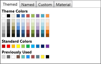
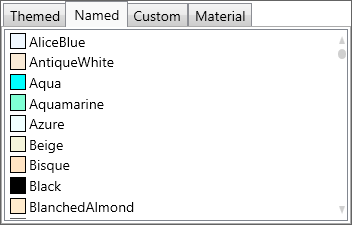
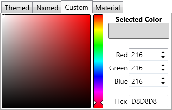
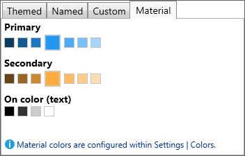
Color Palettes
There are
|
|
|
|
|
Themed Color Palette Allows the user to select a color from a series of themed color palettes. |
Named Color Palette Allows the user to select a color from the basic and extended .NET color keywords. |
Custom Color Palette Allows the user to enter specific RGB values, Hex value or select a color from a broader color palette. |
Material Color Palette Allows the user to select a color which is a shade of the current material skin's primary and secondary colors. |
Converting color values in scripts and macros
It is possible to specify color values in either the hexadecimal-based &H00BBGGRR format or as a decimal value when setting color-based properties dynamically in a script or macro.
It is important to note though, that macros return colors in the hexadecimal format whereas scripts return colors as a decimal value.
Occasionally you may need to convert from the decimal format to the hexadecimal-based format in order to compare values within a script. To do this you can use the following code in your script:
VB SCRIPTvHexColor = "&H00" & Hex(App.ActiveForm.BackColor) JAVASCRIPTvHexColor = "&H00" + App.ActiveForm.BackColor.toString(16); |
See Also
BackColor property | BackStyle property | Color Constants | ForeColor property | UseMaskColor property | UseHoverColor property
Applies To
© 2004-2021 looksoftware. All rights reserved.