Menu Button Control

A Menu button control is used to display a single item from a menu.
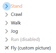
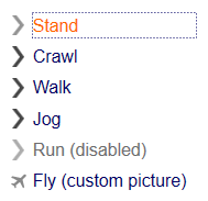
Multiple menu items are normally used together to provide the user with a series of mutually exclusive choices. The recognition engine will automatically generate menu controls when it identifies a pattern of fields consistent with a menu display.
Client support
 Newlook Smartclient
 Newlook Server
Use
A Menu button control combines an Image and Label to represent a menu choice selection. Menu button controls are used to build and present selection sets that graphically mirror the standard OS/400 menu interface.
Host generated menu buttons
A group of menu buttons is automatically generated in the GUI whenever the Newlook recognition engine detects an entry field preceded by a series of output fields which have a format consistent with a menu item.
All automatically generated menu buttons have their BuddyValue, BuddyControl and set so that they are sending the correct value to the relevant host entry field when selected.
The menu item returns a menu item number string using the BuddyValue property. When selected, the menu button control's BuddyValue is automatically entered in the host screen using the screen location specified by the BuddyControl property, subsequently the BuddyKey key is issued to the application (usually the ENTER key).
Inserted menu buttons
Occasionally you may need to provide additional menu items to the user on the screen, in addition to those automatically generated. In this scenario you will need to insert a custom menu button and associate the control with an entry field using the steps outlined below.
Material skin considerations
When the material skin is enabled in your solution, menu buttons will be rendered with material styling. The most noticeable difference is the change in styling when a menu item is selected.
The following menu button properties are ignored when the material skin is enabled: BorderColor Property, BorderStyle Property and BorderWidth Property.
|
Material skin |
Classic skin |
|
|
|
 Common Menu Button Tasks
Inserting a new menu button control
- Open the relevant screen
in Designer (
 )
mode.
)
mode. - Select Insert|MenuButton ()
from the main menu, then use your cursor to draw the graphic area on the
screen.
- With the menu button selected, click the Caption field in the Properties pane and enter the text portion to display.
- Select the OnClick field in the Properties pane and assign the macro or script that is to run when the user clicks the menu (if relevant).
- Set the BuddyControl, BuddyKey, BuddyProperty and BuddyValue to send a value to another control on the form when this menu item is clicked.
- Set any other relevant properties in the Properties pane.
Changing the menu icon
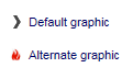
|
The menu button control is rendered as a gray arrow by default however it is possible to assign a different graphic to display in this control. To do this you need to modify the Picture property to point to the image that you want displayed. It is important to note that Newlook uses relative file paths therefore any custom images that you assign to menu controls must be deployed with your Newlook solution files to end users in the same relative location. It is recommended that you create an Images folder within your solution directory which contains all custom images used in your solution. This solution folder can then be deployed to end users and all relative paths remain intact. If you want to change the image that displays in menu button controls globally throughout your application, this can be done via Settings > Display > Menus in Newlook Developer or Newlook Server. |
Binding the menu control to a buddy control
Binding this control to a buddy involves linking it with another control on the form which will be used to display the value and/or send the value through to the host.
- In Designer, select the menu button control.
- From the Properties Pane, select the Text property and enter the text that you want displayed beside the menu icon.
- Set the BuddyControl property. This property should be set to one of two things, either the Name of the control or, if the control is a host field, the Name OR Row and Column position of the control that will display the BuddyValue of the menu button control. If specifying the row and column position of the host field, the co-ordinates must be specified as follows: row, column
- Set the BuddyProperty property. This property should specify the property of the buddy control that is to be set. Typically this is the Text property of an menu entry field.
- If an Aid key is to be sent to the host along with the value of this control then enter the relevant key in the BuddyKey property. Usually with menu controls we want to send the value to the host when the user clicks the menu button therefore we would specify the Enter key here by selecting KeyEnter from the drop down.
- Set the BuddyValue property to specify the actual value that is to be sent to the host when the menu button is clicked.
Properties
Newlook Smartclient | Newlook Server |  Deprecated
|
Deprecated
|  Obsolete
See Also
CommandButton control | OptionButton control
© 2004-2021 looksoftware. All rights reserved.