Label Control

A label control is used to display text on a form. Its contents cannot be edited by the user.
Client support
 Newlook Smartclient
 Newlook Server
Use
A label control is typically used to display text that you do not want the user to be able to change. It is possible, however to dynamically change the text of a label in code in response to events at run-time. For example, if your application takes a few seconds to load, you can display a processing-status message in a label. You can also use a label to identify a control, such as a text box, that does not have its own Caption property. Changing the Border property of a label control can produce a look similar to that of a text box.
 Common Label Tasks
Inserting a label control
- Open the relevant screen
in Designer (
 )
mode.
)
mode. - Select Insert | Label ()
from the main menu, then use your cursor to draw the graphic area on the
screen.
- Set the Caption property to the text you wish to display in the control.
- Set any other relevant properties in the Properties pane. For more information on label properties refer to the properties section of the label control reference topic.
Dynamically updating the text in a label control
An inserted Label control's text component can be set via the Caption property in Designer or via a script or SetValue macro at run-time.
For example, the following macro changes the caption of the Status label to "SYSTEM UPDATE COMPLETE":
SetValue (lblStatus.Caption, "SYSTEM UPDATE COMPLETE")
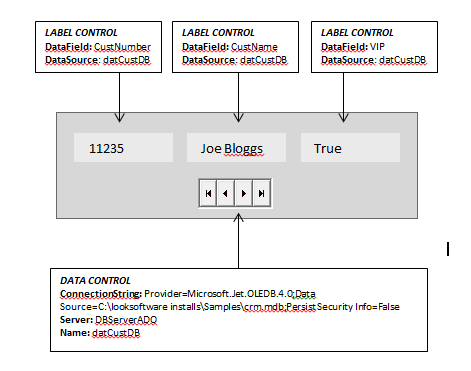
Binding a label to a data control
A label control may be used to display fields from an external database when used in conjunction with a Data control. The inserted data control provides the connection to the database while the label controls are used to display the data.
There are two properties which you need to set to bind the control to your Data control: DataSource and DataField. The DataSource property should be set to the name of your data control, as specified in step 6 above. The DataField property should be set to the name of the field in the database table which you want to display in the control. These properties can be set statically in Designer or dynamically via a script or macro using the SetValue method or action.
Responding to the OnClick event of a label
Sometimes you may want to allow users to click on a label control and respond to that event. An example of this would be providing additional information about the field (in a separate inserted label) when clicked. To do this you would assign a script or macro to the OnClick property of the label.
Properties
Newlook Smartclient | Newlook Server |  Deprecated
|
Deprecated
|  Obsolete
|
Property |
Client |
Description |
|
|
Gets or sets the grid column that this control is aligned to. Design-time only. Not available at run-time. |
|
|
|
Returns or sets a value that determines the alignment of text in a control, values in a column of a data grid control, values in the column header of a list view control or tabs in a tab control. |
|
|
|
Gets or sets whether reserved HTML characters in the label caption are rendered as HTML in Newlook Server. Server only |
|
|
|
Gets or sets the background color of the object. |
|
|
|
Gets or sets a style which determines if the control's background is transparent or opaque. Limited Server support |
|
|
|
Gets or sets whether the caption of the control blinks. Smartclient only |
|
|
|
Gets or sets the control's border color. |
|
|
|
Gets or sets the style of a control's border. |
|
|
|
Gets or sets the width (thickness) of the control's border. |
|
|
|
Gets or sets the control used as the buddy control. |
|
|
|
Gets or sets the AID key to be sent from the buddy control. |
|
|
|
Gets or sets the property of the buddy control that is to be modified. |
|
|
|
Gets or sets the value that is to be passed to the buddy control. |
|
|
|
Gets or sets the caption text of the control. |
|
|
|
Gets or sets the Coded Character Set Identifier (CCSID), which defines the control's code page and character set. |
|
|
|
The green screen column coordinate that marks the beginning of the object. Read only. Host generated controls only. |
|
|
|
Gets or sets the CSS class, or classes, for the control in Newlook Server. Server-only. |
|
|
|
Gets or sets the name of a field within a data source to be displayed in this object. |
|
|
|
Gets or sets the name of the data source for the control. |
|
|
|
Gets or sets the enabled state of the object. |
|
|
|
Gets or sets whether text should be shown in a bold font. |
|
|
|
Gets or sets whether text should be shown with an italic style. |
|
|
|
Gets or sets the name of the font family used to display text. |
|
|
|
Gets or sets the font point size used to display text. |
|
|
|
Gets or sets whether text should be diplayed underlined. |
|
|
|
Gets or sets the foreground (text) color of the control. |
|
|
|
Sets or returns the current control index for an object. |
|
|
|
Returns or sets the height of the object's size in pixels at default size, which is the object's size at design-time. |
|
|
|
Gets or sets the color displayed when the user hovers over the control with a mouse. |
|
|
|
Specifies the anchor tag for the control. |
|
|
|
Determines the distance, in pixels, between the left edge of the control and the left edge of its form or parent container at default size, which is the object's size at design-time. |
|
|
|
Gets or sets the name of this object. |
|
|
|
Gets or sets the name of the macro or script to be run when the Change event is triggered. |
|
|
|
Gets or sets the name of the macro or script to be run when the Click event is triggered. |
|
|
|
Gets or sets the name of a macro or script to be run when the DblClick event occurs. |
|
|
|
Gets or sets the name of the macro or script to be run when the GotFocus event is triggered. Smartclient-only property. |
|
|
|
Gets or sets the name of the macro or script to be run when the LostFocus event is triggered. Smartclient-only property. |
|
|
|
Gets or sets the name of the macro or script to be run when the MouseEnter event occurs. Smartclient-only. |
|
|
|
Gets or sets the name of the macro or script to be run when the MouseExit event occurs. Smartclient-only. |
|
|
|
The green screen row coordinate that marks the beginning of the object. Read only. Host generated controls only. |
|
|
|
Gets or sets a value which determines the control's tab order. |
|
|
|
Gets or sets whether the Tab key can be used to set focus to the control. |
|
|
|
Gets or sets user defined information for the control. |
|
|
|
Gets or sets whether the control will recieve focus when the user clicks on it. |
|
|
|
Gets or sets the text style of the control. |
|
|
|
Gets or sets the control's tool-tip text. |
|
|
|
Determines the distance, in pixels, between the top edge of the control and the top edge of its form or parent container at default size, which is the object's size at design-time. |
|
|
|
Returns a value which specifies the control's type. Read only. |
|
|
|
Gets or sets a value which determines whether the HoverColor property will be used. Smartclient-only. |
|
|
|
Gets or sets whether the control's keystroke mnemonic is embedded within the text. |
|
|
|
Gets or sets the name of the variable that stays synchronized with the contents of the control. |
|
|
|
Gets or sets whether the control, object or form is visible or hidden. |
|
|
|
Gets or sets the width of the object in pixels at default size, which is the object's size at design-time. |
|
|
|
Gets or sets a value which turns on word-wrapping within the control. |
See Also
Text box control | Picture box control
© 2004-2021 looksoftware. All rights reserved.