Command Button Control

A command button, also known as a push button, is a clickable control.
Client support
 Newlook Smartclient
 Newlook Server
Use
When clicked, a command button can be configured to run a specific macro or script, hence they are useful if you need to provide users with the option to execute some logic. When a command button is clicked, the OnClick event is triggered. A macro or script can be assigned to the OnClick property of the button to perform the logic required.
The following are ways to select a command button at run-time:
- Use the mouse to click the button.
- Move the focus to the button by pressing the TAB key, and then choose the button by pressing the SPACEBAR or ENTER.
- Press an access key (ALT+the underline character) for a command button.
- If the command button is the default command button for a form, pressing ENTER selects the button.
Use the Caption property to display text on the button itself and the ToolTipText property to provide information when the user hovers over the button.
TIP!
The PictureBox and Label controls also recognize the Click event, so you can use them as an alternative to a command button.
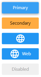
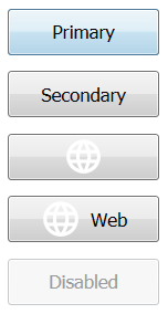
Material skin considerations
When the material skin is enabled in your solution, by default command buttons will be rendered as flat buttons in your specified primary color. If the ForeColor Property or BackColor Property have been set then these colors will be respected. The UseSecondaryColor Property renders the button in your specified material secondary color, which is useful if you wish to highlight a particular button on the screen.
The following command button properties are ignored when the material skin is enabled: HoverColor Property, BorderColor Property, BorderStyle Property, BorderWidth Property and UseHoverColor Property.
|
Material skin |
Classic skin |
|
|
|
 Common Command Button Tasks
Inserting a command button control
- Open the relevant screen
in Design (
 )
mode.
)
mode. - Select Insert | CommandButton ()
from the main menu, then use your cursor to draw the graphic area on the
screen.
- With the command button selected, select Caption in the Properties pane and enter the text that you want to appear on the button.
- If you would like additional information to be displayed when the user hovers over the button set the ToolTipText property.
- Locate the Events section of the Properties pane, and assign a macro or script to the OnClick property.
Assigning an keyboard shortcut for a command button
- Select the command button control.
- Use an ampersand (&) in the command button's Caption property to assign a shortcut key for the button.
This allows the user to be able to use the ALT key in combination with the character immediately after the ampersand, to click the button.
Properties
Newlook Smartclient | Newlook Server |  Deprecated
|
Deprecated
|  Obsolete
|
Property |
Client |
Description |
|
|
Returns or sets a value that determines the alignment of text in a control, values in a column of a data grid control, values in the column header of a list view control or tabs in a tab control. |
|
|
|
Gets or sets the background color of the object. |
|
|
|
Gets or sets a style which determines if the control's background is transparent or opaque. |
|
|
|
Gets or sets whether the caption of the control blinks. |
|
|
|
Gets or sets the control's border color. |
|
|
|
Gets or sets the style of a control's border. |
|
|
|
Gets or sets the width (thickness) of the control's border. |
|
|
|
Gets or sets the control used as the buddy control. |
|
|
|
Gets or sets the AID key to be sent from the buddy control. |
|
|
|
Gets or sets the property of the buddy control that is to be modified. |
|
|
|
Gets or sets the value that is to be passed to the buddy control. |
|
|
|
Gets or sets the caption text of the control. |
|
|
|
Gets or sets the Coded Character Set Identifier (CCSID), which defines the control's code page and character set. |
|
|
|
The green screen column coordinate that marks the beginning of the object. Read only. Host generated controls only. |
|
|
|
Gets or sets the CSS class, or classes, for the control in Newlook Server. Server-only. |
|
|
|
Gets or sets the image file to be displayed in a form or control when it is in the disabled state. |
|
|
|
Gets or sets the image file to display in the form or control when it has ben clicked. |
|
|
|
Gets or sets the enabled state of the object. |
|
|
|
Gets or sets whether text should be shown in a bold font. |
|
|
|
Gets or sets whether text should be shown with an italic style. |
|
|
|
Gets or sets the name of the font family used to display text. |
|
|
|
Gets or sets the font point size used to display text. |
|
|
|
Gets or sets whether text should be diplayed underlined. |
|
|
|
Gets or sets the foreground (text) color of the control. |
|
|
|
Sets or returns the current control index for an object. |
|
|
|
Returns or sets the height of the object's size in pixels at default size, which is the object's size at design-time. |
|
|
|
Gets or sets the color displayed when the user hovers over the control with a mouse. |
|
|
|
Gets or sets the image file to display in the form or control when it the user hovers over it with a mouse. |
|
|
|
Determines the distance, in pixels, between the left edge of the control and the left edge of its form or parent container at default size, which is the object's size at design-time. |
|
|
|
Returns or sets the color in a bitmap
image that should be interpreted as the transparent color. Deprecated property. |
|
|
|
Gets or sets the name of this object. |
|
|
|
Gets or sets the name of the macro or script to be run when the Click event is triggered. |
|
|
|
Gets or sets the name of the macro or script to be run when the GotFocus event is triggered. Smartclient-only property. |
|
|
|
Gets or sets the name of the macro or script to be run when the LostFocus event is triggered. Smartclient-only property. |
|
|
|
Gets or sets the name of the macro or script to be run when the MouseEnter event occurs. Smartclient-only. |
|
|
|
Gets or sets the name of the macro or script to be run when the MouseExit event occurs. Smartclient-only. |
|
|
|
Gets or sets the file name of the image to display in the control or form. |
|
|
|
Gets or sets the image alignment in the parent container (form or control). |
|
|
|
Sets or returns the color mapping that
is used to display an image in a form or control. Deprecated property. |
|
|
|
Gets or sets a value which determines the opacity of a picture in a form or control. |
|
|
|
Sets or returns the image quality of
a picture that appears in a form or control. Deprecated property. |
|
|
|
Gets or sets the way a picture is sized in its container. Smartclient-only. |
|
|
|
Sets or gets a value which determines the method in which a picture
is tiled in the container (can be either a form or control). Deprecated property. |
|
|
|
The green screen row coordinate that marks the beginning of the object. Read only. Host generated controls only. |
|
|
|
Gets or sets a value which determines the control's tab order. |
|
|
|
Gets or sets whether the Tab key can be used to set focus to the control. |
|
|
|
Gets or sets user defined information for the control. |
|
|
|
Gets or sets whether the control will recieve focus when the user clicks on it. |
|
|
|
Gets or sets the text style of the control. |
|
|
|
Gets or sets the control's tool-tip text. |
|
|
|
Determines the distance, in pixels, between the top edge of the control and the top edge of its form or parent container at default size, which is the object's size at design-time. |
|
|
|
Returns a value which specifies the control's type. Read only. |
|
|
|
Gets or sets a value which determines whether the HoverColor property will be used. Smartclient-only. |
|
|
|
Determines whether the color assigned in the MaskColor
property is used. Deprecated property. |
|
|
|
Gets or sets whether the control's keystroke mnemonic is embedded within the text. |
|
|
|
Gets or sets a value which determines whether the control will be rendered using the material secondary color instead of the default primary color. Material-only property. |
|
|
|
Gets or sets the name of the variable that stays synchronized with the contents of the control. |
|
|
|
Gets or sets whether the control, object or form is visible or hidden. |
|
|
|
Gets or sets the width of the object in pixels at default size, which is the object's size at design-time. |
|
|
|
Gets or sets a value which turns on word-wrapping within the control. |
See Also
Label control | PictureBox control
© 2004-2021 looksoftware. All rights reserved.