Check Fields

Use check field rules to change the Check Field recognition rules used by Newlook.
A check field ( ), also known as a check box, is generated in the GUI whenever the Newlook recognition engine detects an entry field associated with two field choice values (for example Y,N) that are defined within Check Field Rules. You can access check field recognition rules by selecting Rules
| Check Fields from the developer bar.
To view or modify an individual check field recognition rule, select
it from the list and update its properties.
), also known as a check box, is generated in the GUI whenever the Newlook recognition engine detects an entry field associated with two field choice values (for example Y,N) that are defined within Check Field Rules. You can access check field recognition rules by selecting Rules
| Check Fields from the developer bar.
To view or modify an individual check field recognition rule, select
it from the list and update its properties.
The Check Field rules editor can be used to:
- Create a new check field value definition (click the New button).
- Delete existing check field definitions (click the Delete button).
- Edit existing check field definitions.
- Edit the two global check field options, Explicit check field choices are required and Use 3-state check boxes.
For example, most English language sid files will contain a Check Field rule for the field choice values Y and N, therefore the following Y/N combinations will be recognized as valid check field candidates:
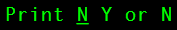
|
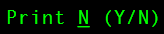
|
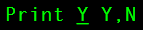
|
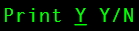
|
TIP!
Check Field rules will be applied in the same order as they are listed in the description window. If you wish to have one check field definition as the default for all locales and one or more different check field definitions as the default for specific locales then you will need to move the All Locales default to the bottom of the list.
Choices
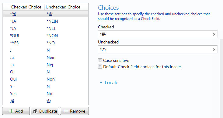
Use the check field choices window to add custom checked and unchecked choice pairs to the list.
|
Option |
Description |
|
Checked |
This is the text string or character that represents the checked state for a true or false argument, e.g. Yes or Y. |
|
Unchecked |
This is the text string or character that represents the unchecked state for the true or false argument, e.g. No or N. |
|
Case sensitive |
Check this option if you want the recognition engine to respect the case of the checked and unchecked choices. With this option selected, the Newlook recognition engine will only generate a check field if the options found exactly match the case specified in the Check Field rule definition. |
|
Default Check Field choices for this locale |
Assign this choice pair as the default check field choice for this locale. If selected, this option will be the default for any of the selected locales in the Locale drop down and can be used to generate a check field even if the associated field choices are not present on the screen. This scenario occurs when one of the choices is present in a single character entry field and the Explicit field choicesrequired option is turned OFF. |
Locale
Use Locale information to customize check field recognition rules for specific regional requirements. If a locale is specified here, then the selected check field rule will only be applied if the locale specified is the same as the current locale.
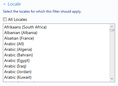
If All Locales is selected, then the check field rule will be applied universally, regardless of the current locale.
To select specific locales, deselect the All Locales option and click on one or more locales. For example, if the selected locale for a check field rule is German (All), the check field recognition filter will be applied to all German screens, including variations such as German (Austria). Any combination of locales can be selected so as check field choices can be applied to German (Luxembourg) and German (Liechtenstein), but no other variations of German.
Options
 Explicit check field choices are required
If this option is selected then check fields will only be generated when the defined field choices exist on the screen next to the entry field. If this option is turned off then check fields will be generated for single-character entry fields containing one of the default options for the locale even if the field choices are not present.
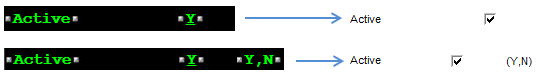
Let's look at some examples. We'll assume that the default check field choice for the current locale is Y/N.
With the Explicit check field choices are required option selected the following host screen elements will be generated as follows:
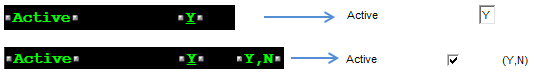
With the Explicit check field choices are required option de-selected the following host screen elements will be generated:
Use 3-state check boxes
A check box can have three states, checked, un-checked and unknown, or two states, checked and un–checked. By default checkboxes will be generated as two-state check fields unless this option is selected. If selected, three-state check boxes will be generated if two defined values are detected, and the corresponding entry field also allows a blank. Tri-state check boxes can be grayed (dimmed) as well as checked or unchecked. The grayed state is used to show that the state of the check box is unknown. Note: A 3-state check box may be required to enter a blank value in some screens.
How to define a new check field rule
Use the following steps to define a new rule for check box recognition to assist in the auto-generation of check boxes within your application. The rule can be locale–specific or global.
For example, if your application had a large number of single-character entry fields that could accept either S or N (Si or Non) as valid choices, you may wish to define a new check field rule for this scenario to prevent having to individually recognize each entry field as a check field in Identify.
To add a new check field rule:
- Select Rules | Check Fields from the developer bar.
- Click the Add
 button.
Choices
- In the Checked field of the properties pane, enter the text string or character that represents the checked state for a true or false argument, e.g. Si or S.
- In the Unchecked Choice field, enter the text string or character that represents the unchecked state for a true or false argument, e.g. Non or N.
- If you want the recognition engine to respect the case of the checked and unchecked choices then select the Case sensitive field. With this option selected, the Newlook recognition engine will only generate a check field if the options found exactly match the case specified in the Check Field rule definition.
- If applicable, check the option to assign this check field as the Default check field choice for this locale. If selected, this option will be the default for any of the selected locales in the Locale drop down and can be used to generate a check field even if the associated field choices are not present on the screen. This scenario occurs when one of the choices is present in a single character entry field and the Explicit field choices required option is turned OFF.
Locale
- If you wish to activate this rule for specific locales only then expand the Locales section, deselect the All Locales option and select one or more locale to which this check field should apply.
- Click the Save button
(
 ) to save your changes.
ALERT!
At runtime, if the locale for this check field rule matches the location of the active connection, then all areas of an incoming screen will be scanned to locate the check field values defined here. The only exception to this is if checkbox recognition in General Rules is turned off.
See Also
Checkbox control | Recognition rules
© 2004-2021 looksoftware. All rights reserved.