ListBox Control

A List box control displays a list of items from which the user can select one or more.
Client support
 Newlook Smartclient
 Newlook Server
Use
A list box control is similar to a combo box control except that it can display as many items in its initial list as its height will allow.
If the number of items exceeds the number that can be displayed, a scroll bar is automatically added to the list box control.
Combo vs list box
As a general rule, a combo box control is recommended when you want to provide a list of suggested choices, whereas a list box is appropriate when you want to limit input to a set list of items. A combo box control contains an edit field, hence choices that are not in the list can be entered into the field. List box entry is restricted to items in its list. It is worth noting however that a combo box can be configured so that user entry is restricted to items in the drop down list. This is done by setting the Style property of a combo box control to ComboDropDownList.
The main difference between the two control is the way the list is displayed. In a combo box the full list is not displayed until you click the down arrow, whereas in a list box control, the list is initially visible within the control area.
Unlike the combo box control, a list box control will never be automatically generated from a host field.
BE AWARE THAT:
If your list box control contains more than two list items then it will need to be high enough to sufficiently display two items in its body or it will not be usable in Newlook Server. If the height of the control is not high enough, then items in the list may be skipped when the user clicks the control's arrow buttons in Newlook Server. If you do not have enough space on your form for the required height, consider using a read-only ComboBox control instead.
Material skin considerations
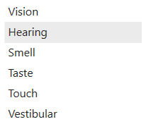
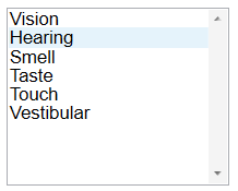
When the material skin is enabled in your solution, list boxes will be rendered with material styling. The most noticeable difference is an increase in the spacing within the list itself.
|
Material skin |
Classic skin |
|
|
|
 Common List Box Tasks
Inserting a ListBox Control
- Open the relevant screen
in Designer (
 )
mode.
)
mode. - Select Insert | ListBox ()
from the main menu, then use your cursor to draw the graphic area on the
screen.
- Configure the List property to determine the items that will display in the control's list (see section below).
Specifying the list array
A list box list can be set in two ways, either in Designer via the List property or dynamically via a macro or script (see section below).
The list item string may be an array of value and descriptions or values only.

|
If you wish to display both values and descriptions in
the drop down list then the string must include the value and description
separated by an equals (=) character. For
example: The value and the description will then be shown in separate columns in the list. |

|
If you wish to just display a list of values without a
description then the string will consist of semi-colon delimited values.
For example: The value only will be displayed in the list. |
For more detailed information on creating the list item array refer to the List Property topic.
Dynamically creating, appending and removing items from the list array
A ListBox control's list item array can be dynamically modified via a SetValue action in the macro editor, or by using the AddItem, RemoveItem or Clear methods in a script.
For example, the following macro populates the listBox with four items:
SetValue (lstTest.List, "Option 1;Option 2;Option 3; Option 4;")
Specifying a list index of -1 allows you to append an item to the list item array. The following macro adds the item "Option 5" to the existing control's list:
SetValue (lstTest.List(-1), "Option 5")
The index of the new item is specified in the NewIndex property of the control.
Sorting list items
You can specify that items be added to a list in alphabetical order by setting the Sorted property to True. The sort is not case sensitive: thus, the words "All" and "all" are treated the same.
After sorting the index of items in the list will change to reflect their new position in the list. The NewIndex property can be used to determine the index of any items dynamically added to a sorted listbox.
Referencing list item array elements
The List property provides access to all items in the list. It contains an array in which each item in the list is an element of the array. Each item is represented in string form. To refer to an item in the list, use this syntax:
App.ActiveForm.control.List (index)
where control is your named list box, and index is the position of the list item within the array. The top item has an index of 0; the next item has an index value of 1, and so on.
For example, the following code inserts the third item (index = 2) of a listbox list into a textbox called txtMyTextBox:
App.ActiveForm.txtMyTextBox.Text = App.ActiveForm.lstMyListBox.List (2)
Determining the currently selected item
The Text property returns the value of the currently selected item while the ListIndex property returns the index of the currently selected item. The List items array is a zero based array therefore the first item in the list will have a ListIndex of 0 and the value of the ListCount property is always one more than the index of the uppermost element. If no item is selected, the ListIndex property returns -1.
Properties
Newlook Smartclient | Newlook Server |  Deprecated
|
Deprecated
|  Obsolete
Methods
Available in Newlook Smartclient. Available in Newlook Server. Deprecated.
|
Method |
Client |
Description |
|
|
Adds a new item to the list of values displayed. |
|
|
|
Clears the contents of the specified object. |
|
|
|
Removes an existing item from the list of values displayed. |
See Also
ComboBox control | List property
© 2004-2021 looksoftware. All rights reserved.