SmartNav Control

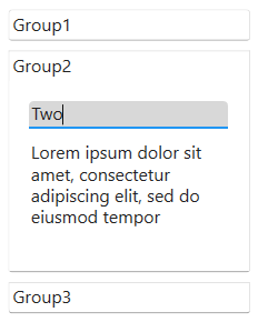
The SmartNav control consists of a rectangular panel containing a display window and navigation buttons.
Client support
 Newlook Smartclient
 Newlook Server
Use
The control is used to provide a sophisticated and flexible navigation tool for end users. It can be used to visually group links to functions, applications or web sites in a single, easy to use control. It is typically placed onto a project's Master Form to provide a consistent navigation tool for applications.
The SmartNav control consists of one or more navigation Group objects in a Groups collection. You can add and remove navigation Groups using the Groups property of the SmartNav Control at design time. You can change the appearance and behavior of the control and each navigation Group button and respective display area by setting properties. To add links to a navigation Group's display area you can either drag and drop form label controls onto the relevant display area or insert new label controls.
To open the properties of an individual navigation Group in Design view, click the relevant Group button so that it is highlighted and then select that group's display area.
Material skin considerations
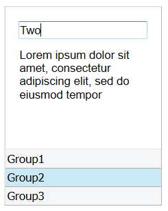
When the material skin is enabled in your solution, smart nav controls will be rendered according to material principles, as an accordion control. The groups are vertically stacked and each group expands to reveal the content in that group. By default, the hover color for a group button will be a shade of the material primary color.
The following smart nav and smart nav group properties are ignored when the material skin is enabled: BorderColor Property, BackStyle Property (for the group) and ButtonSelectedColor Property (for the group).
|
Material skin |
Classic skin |
|
|
|
 Common SmartNav Tasks
Inserting a SmartNav control onto a master form
- Open the relevant Master
Form in Designer (
 ) mode.
 - Select Insert|SmartNav
(
 ) from the main menu, then use your cursor to draw the graphic area on the
screen.
) from the main menu, then use your cursor to draw the graphic area on the
screen. - Select the SmartNav control then open the Groups Collection Editor by clicking the prompt next to the Groups property in the Properties pane.
- Add as many navigation groups as is necessary. As each group is added, an associated group button will be added within the SmartNav control. These buttons control the content of the SmartNav display window. As each button is pressed the associated navigation links related to that group will appear in the display area. For each group that is created, Newlook creates an associated group object which is added to the Navigation groups collection.
- If required, tab through the property fields for each group and change any relevant properties i.e. Back color, Button Colors and names etc. For more information on available SmartNav properties refer to the properties section of the reference topic.
- Click OK to close the Groups Collection Editor.
- Modify the properties of the SmartNav control if necessary.
Inserting controls onto smart nav groups
- In the SmartNav control, select the first group button to select that group object. We will now insert the navigation links associated with this Group.
- From the File menu select Insert | Control (typical controls inserted on a smartNav are labels, pictureboxes and command buttons) and draw the relevant control area on the navigation group area. Set any relevant properties for the control including the OnClick property to the relevant URL or macro/script.
- Repeat the above step until you have inserted all the links for this Group.
- Select the second Group button (note that the button will appear in a different color once selected) and insert labels for the links that will be displayed in this Group.
- Repeat the above steps for all the Navigation Buttons.
- Save your changes to the Master Form and exit.
Responding to user actions
There are various properties which allow you to respond to user actions in the SmartNav control. Each individual navigation group and the control itself has an OnClick property which allows you to run a macro or script when the group or control, respectively, is clicked. In addition, the smartNav control has an OnSelChanging property which allows you to run code when a user selects a different navigation group, but before the new group is loaded. This is useful if you are needing to perform validation on the group the user is about to leave. The OnSelChanged property is similar but allows you to run code after a user has selected a different navigation group. Use this property to perform any pre-display processing on the group the user is navigating to.
Properties
Newlook Smartclient | Newlook Server |  Deprecated
|
Deprecated
|  Obsolete
|
Property |
Client |
Description |
|
|
Gets or sets the index of the active navigation group in the SmartNav control. |
|
|
|
Gets or sets the control's border color. |
|
|
|
Gets or sets the Coded Character Set Identifier (CCSID), which defines the control's code page and character set. |
|
|
|
Gets or sets the CSS class, or classes, for the control in Newlook Server. Server-only. |
|
|
|
Gets or sets the enabled state of the object. |
|
|
|
Gets or sets whether text should be shown in a bold font. |
|
|
|
Gets or sets whether text should be shown with an italic style. |
|
|
|
Gets or sets the name of the font family used to display text. |
|
|
|
Gets or sets the font point size used to display text. |
|
|
|
Gets or sets whether text should be diplayed underlined. |
|
|
|
Returns the collection of SmartNav groups. |
|
|
|
Returns or sets the height of the object's size in pixels at default size, which is the object's size at design-time. |
|
|
|
Determines the distance, in pixels, between the left edge of the control and the left edge of its form or parent container at default size, which is the object's size at design-time. |
|
|
|
Gets or sets the name of this object. |
|
|
|
Gets or sets the name of the macro or script to be run when the Click event is triggered. |
|
|
|
Gets or sets the name of a macro or script to be run when the DblClick event occurs. |
|
|
|
Gets or sets the name of the macro or script to be run when the GotFocus event is triggered. Smartclient-only property. |
|
|
|
Gets or sets the name of the macro or script to be run when the LostFocus event is triggered. Smartclient-only property. |
|
|
|
Gets or sets the name of the macro or script to be run when the MouseEnter event occurs. Smartclient-only. |
|
|
|
Gets or sets the name of the macro or script to be run when the MouseExit event occurs. Smartclient-only. |
|
|
|
Gets or sets the name of the macro or script to be run when the SelChanged event occurs. |
|
|
|
Gets or sets the name of the macro or script to be run when the SelChanging event occurs. |
|
|
|
Gets or sets user defined information for the control. |
|
|
|
Gets or sets the control's tool-tip text. |
|
|
|
Determines the distance, in pixels, between the top edge of the control and the top edge of its form or parent container at default size, which is the object's size at design-time. |
|
|
|
Returns a value which specifies the control's type. Read only. |
|
|
|
Gets or sets whether the control, object or form is visible or hidden. |
|
|
|
Gets or sets the width of the object in pixels at default size, which is the object's size at design-time. |
Methods
None.
See Also
Groups Collection | Group Object
© 2004-2021 looksoftware. All rights reserved.