UpDown Control

An UpDown control is a pair of arrow buttons that the user can click to increment or decrement a numerical value in an associated control, known as a buddy control.
Client support
 Newlook Smartclient
 Newlook Server
Use
Typically an UpDown control is used with a label or textbox control to display the UpDown control's value. They are useful if you want to provide the user with a simple tool for selecting a numeric value and that value has a fixed range. The Min and Max properties can be set to ensure that the user is restricted to the range specified.
Material skin considerations
When the material skin is enabled in your solution, up down controls will be rendered as a flat control in a shade of your primary material color. There is no change to the behavior of this control or any supported properties.
|
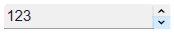
Material skin |
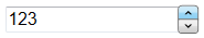
Classic skin |
|
|
|
 Common Up Down Tasks
Inserting an UpDown Control
- Open the relevant screen
in Designer (
 )
mode.
)
mode. - Select Insert|CheckBox ()
from the main menu, then use your cursor to draw the graphic area on the
screen.
- Set any relevant properties in the Properties pane. For more information on commonly used check box properties refer to the UpDown Control reference topic.
Setting a limit for UpDown selection
- In Designer, select the UpDown control.
- From the Properties Pane, set the Max property. This value should be the highest limit of your range.
- Set the Min property to the lowest limit of your range.
For example, if you wanted to restrict a user's selection to values from 5 to 15 only then you would set the Max property as 15 and the Min property as 5.
Binding the control to a buddy control
Binding this control to a buddy involves linking it with another control on the form which will be used to display the value or send the value through to the host.
- In Designer, select the UpDown control.
- From the Properties Pane, set the BuddyControl property. This property should be set to one of two things, either the Name of the control or, if the control is a host field, the Name or Row and Column position of the control that will display the value of the UpDown control. If specifying the row and column position of the host field, the co-ordinates must be specified as follows: row, column
- Set the BuddyProperty property. This property should specify the property of the buddy control that is to be set.
For example, if you wanted to provide users with an UpDown control to set the value of a textbox located at row 5 and column 35 in the host then you would set the BuddyControl property to 5,35 and the BuddyProperty to Text.
Properties
Newlook Smartclient | Newlook Server |  Deprecated
|
Deprecated
|  Obsolete
|
Property |
Client |
Description |
|
|
Gets or sets the grid column that this control is aligned to. Design-time only. Not available at run-time. |
|
|
|
Gets or sets the control used as the buddy control. |
|
|
|
Gets or sets the property of the buddy control that is to be modified. |
|
|
|
The green screen column coordinate that marks the beginning of the object. Read only. Host generated controls only. |
|
|
|
Gets or sets the CSS class, or classes, for the control in Newlook Server. Server-only. |
|
|
|
Gets or sets the enabled state of the object. |
|
|
|
Sets or returns the current control index for an object. |
|
|
|
Returns or sets the height of the object's size in pixels at default size, which is the object's size at design-time. |
|
|
|
Determines the distance, in pixels, between the left edge of the control and the left edge of its form or parent container at default size, which is the object's size at design-time. |
|
|
|
Gets or sets the control's maximum value. |
|
|
|
Gets or sets the control's minimum value. |
|
|
|
Gets or sets the name of this object. |
|
|
|
Gets or sets the name of the macro or script to be run when the Change event is triggered. |
|
|
|
Gets or sets the name of the macro or script to be run when the DownClick event occurs. |
|
|
|
Gets or sets the name of the macro or script to run when the UpClick event occurs. |
|
|
|
Sets or returns the orientation of the control. Read-only at runtime. |
|
|
|
The green screen row coordinate that marks the beginning of the object. Read only. Host generated controls only. |
|
|
|
Gets or sets a value which determines the control's tab order. |
|
|
|
Gets or sets whether the Tab key can be used to set focus to the control. |
|
|
|
Gets or sets user defined information for the control. |
|
|
|
Gets or sets the control's tool-tip text. |
|
|
|
Determines the distance, in pixels, between the top edge of the control and the top edge of its form or parent container at default size, which is the object's size at design-time. |
|
|
|
Returns a value which specifies the control's type. Read only. |
|
|
|
Gets or sets the state of the control. |
|
|
|
Gets or sets the name of the variable that stays synchronized with the contents of the control. |
|
|
|
Gets or sets whether the control, object or form is visible or hidden. |
|
|
|
Gets or sets the width of the object in pixels at default size, which is the object's size at design-time. |
|
|
|
Gets or sets a value that determines whether the control's value wraps around the maximum and minimum value. |
Methods
None.
See Also
© 2004-2021 looksoftware. All rights reserved.