TrackBar Control

The TrackBar control is used for visually adjusting numeric settings.
Client support
 Newlook Smartclient
 Newlook Server
Use
The TrackBar control has two parts: the thumb, also known as a slider, and the tick marks. The thumb is the part that can be adjusted by the user. Its position corresponds to the Value property. The tick marks are visual indicators that are spaced at regular intervals. The trackbar moves in increments that you specify and can be aligned horizontally or vertically.
For example, if you wanted your TrackBar to offer the units 0 to 5 then you would set the Min property to '0' and the Max property to '5'. The Value property dictates the default slider position when the control is created. The TickFrequency property dictates the frequency of tick marks relative to the measurement units. If you only wanted to display a tick mark for every second unit then you would set the TickFrequency property to 2.
Material skin considerations
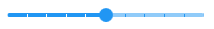
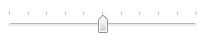
When the material skin is enabled in your solution, track bars will be rendered with material styling. The most noticeable difference is the control is rendered flat, in the material primary color. Apart from the TickStyle Property, which is partially supported, there is no change to the behavior of this control or any other supported properties.
|
Material skin |
Classic skin |
|
|
|
 Common Track Bar Tasks
Inserting an TrackBar Control
- Open the relevant screen
in Designer (
 )
mode.
)
mode. - Select Insert|TrackBar ()
from the main menu, then use your cursor to draw the graphic area on the
screen.
- Set any relevant properties in the Properties pane. For more information on commonly used check box properties refer to the properties section of the Control reference topic.
Setting a limit for track bar selection
- In Designer, select the track bar control.
- From the Properties Pane, set the Max property. This value should be the highest limit of the range from which users can select.
- Set the Min property to the lowest limit of your range.
- Set the Value property to the start value.
- Set the TickFrequency to the distance that you want between tick marks.
- Set the LargeChange property to the amount that the control increments or decrements if the user clicks in the trackBar area.
- Set the SmallChange property to the amount that the control increments or decrements if the user manually adjusts the track bar.
For example, if you wanted to restrict a user's selection to values from 5 to 15 and trackbar intervals for each unit then you would set the Max property as 15, the Min property as 5 and the TickFrequency property as 1.
Setting tick orientation
The Orientation property determines how ticks will display in the track bar control:

|

|

|

|
Properties
Newlook Smartclient | Newlook Server |  Deprecated
|
Deprecated
|  Obsolete
|
Property |
Client |
Description |
|
|
Gets or sets the enabled state of the object. |
|
|
|
Sets or returns the current control index for an object. |
|
|
|
Returns or sets the height of the object's size in pixels at default size, which is the object's size at design-time. |
|
|
|
Gets or sets the amount that the control's value will vary when the TrackBar or ScrollBar area is clicked. Smartclient-only. |
|
|
|
Determines the distance, in pixels, between the left edge of the control and the left edge of its form or parent container at default size, which is the object's size at design-time. |
|
|
|
Gets or sets the control's maximum value. |
|
|
|
Gets or sets the control's minimum value. |
|
|
|
Gets or sets the name of this object. |
|
|
|
Gets or sets the name of the macro or script to be run when the Change event is triggered. |
|
|
|
Gets or sets the name of the macro or script to be run when the Click event is triggered. |
|
|
|
Gets or sets the name of a macro or script to be run when the DblClick event occurs. |
|
|
|
Gets or sets the name of the macro or script to be run when the GotFocus event is triggered. Smartclient-only property. |
|
|
|
Gets or sets the name of the macro or script to be run when the LostFocus event is triggered. Smartclient-only property. |
|
|
|
Sets or returns the orientation of the control. Read-only at runtime. Smartclient only for this control. |
|
|
|
Gets or sets a value that determines whether the track bar should display a highlighted range within the tick mark window. Smartclient-only. |
|
|
|
Gets or sets the length of the selection range within the tick mark window. Smartclient-only. |
|
|
|
Gets or sets the starting position for the tick mark window selection range. Smartclient-only. |
|
|
|
Gets or sets the amount that the control's value will vary when the TrackBar or ScrollBar are manually adjusted. |
|
|
|
Gets or sets a value which determines the control's tab order. |
|
|
|
Gets or sets whether the Tab key can be used to set focus to the control. |
|
|
|
Gets or sets user defined information for the control. |
|
|
|
Gets or sets the interval between ticks. Smartclient-only. |
|
|
|
Gets or sets the placement of ticks on the track bar. Smartclient-only. |
|
|
|
Determines the distance, in pixels, between the top edge of the control and the top edge of its form or parent container at default size, which is the object's size at design-time. |
|
|
|
Returns a value which specifies the control's type. Read only. |
|
|
|
Gets or sets the state of the control. |
|
|
|
Gets or sets the name of the variable that stays synchronized with the contents of the control. |
|
|
|
Gets or sets whether the control, object or form is visible or hidden. |
|
|
|
Gets or sets the width of the object in pixels at default size, which is the object's size at design-time. |
See Also
© 2004-2021 looksoftware. All rights reserved.