GooglePieChart Control

The GooglePieChart control allows you to represent your data as a Pie Chart within your Newlook form.
Client support
 Newlook Smartclient
 Newlook Server
Use
This control is useful when you are trying to compare each category of data, proportionally against the whole. Pie charts are only useful if your data contains a group of categories and a measure of each group that combine to make up a whole.
The GooglePieChart control requires a 2-dimensional data source, where each row of data represents a slice of the pie. One column, specified as the DomainAxis property, will determine the label or category of each pie chart segment. A second column, specified in the DataAxis property, will determine the value of each slice, in other words, the size of each pie chart segment.
There are two ways of specifying the data source for your chart:
1. Any datagrid control on your form can be used as the data source for you chart. The datagrid can be generated from a host subfile or bound to an external datasource.
2. If you have OpenLook installed on your IBMi, the SQL function can be used to query a host database file and return the results of that query as data source of your chart.
Regardless of which data source you use, the first column of data will be automatically assigned to the DomainAxis and the second column to the DataAxis. You can change these values however if you wish to chart different columns of data.
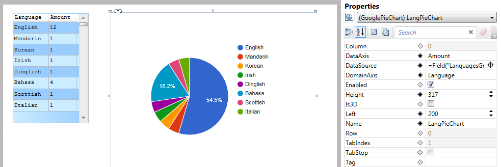
In the example below, the data source is an existing grid on our form. The first column of data, Language, has been set as the DomainAxis. It is represented as labels on each segment. The second column, Amount, has been set as the DataAxis. It determines the proportional size of each segment.
Specify a datagrid on your form as the source for your chart
- Insert a GooglePieChart
control () on your form.
- With the GooglePieChart control selected, select the DataSource property and click the Field Picker (
 ) icon (your mouse pointer will change to a cross-hair pointer).
 - Select the datagrid control containing columns of data that you want to represent in the chart.
- In the DomainAxis property enter the name of the datagrid column that represents the type of data you are charting (i.e. your pie segment labels)
- In the DataAxis property enter the name of the datagrid column that represents the value of the data you are charting (i.e. your pie segment values)
Use the results of a query as the source for your chart
- With the GooglePieChart control selected, select the DataSource property and enter the following expression:
=SQL("Connection", "SQL Query")
Where Connection is an existing connection to your host, and SQL Statement is a valid SQL statement.
- In the DomainAxis property enter the name of the column that represents the category of data you are charting (i.e. the labels on each pie chart segment)
- In the DataAxis property enter the name of the column that represents the value of the data you are charting (i.e. the size of each pie chart segment)
BE AWARE THAT:
OpenLook must be installed on your host machine in order to return the results of an SQL query on a host database file.
Newlook Smartclient | Newlook Server |  Deprecated
|
Deprecated
|  Obsolete
|
Property |
Client |
Description |
|
|
The green screen column coordinate that marks the beginning of the object. Read only. Host generated controls only. |
|
|
|
Gets or sets the data set that will become the label for the chart segment or bar. |
|
|
|
Gets or sets the name of the data source for the control. |
|
|
|
Gets or sets the data set that will determine the chart segment or bar. |
|
|
|
Gets or sets the enabled state of the object. - limited, Newlook Smartclient-only support. |
|
|
|
Returns or sets the height of the object's size in pixels at default size, which is the object's size at design-time. |
|
|
|
Gets or sets whether the chart should be rendered in 3D. |
|
|
|
Determines the distance, in pixels, between the left edge of the control and the left edge of its form or parent container at default size, which is the object's size at design-time. |
|
|
|
Gets or sets the name of this object. |
|
|
|
The green screen row coordinate that marks the beginning of the object. Read only. Host generated controls only. |
|
|
|
Gets or sets a value which determines the control's tab order. |
|
|
|
Gets or sets whether the Tab key can be used to set focus to the control. |
|
|
|
Gets or sets user defined information for the control. |
|
|
|
Gets or sets the chart's title. |
|
|
|
Determines the distance, in pixels, between the top edge of the control and the top edge of its form or parent container at default size, which is the object's size at design-time. |
|
|
|
Returns a value which specifies the control's type. Read only. |
|
|
|
Gets or sets whether the control, object or form is visible or hidden. |
|
|
|
Gets or sets the width of the object in pixels at default size, which is the object's size at design-time. |
Client limitations
Server only
See Also